Category: TypoPage 4 of 4
Video is a part of the ongoing “Future series” by Italian artist Filippo Minelli. “Built to Burn” is the title Revok gave to the burning of the TheSeventhLetter…
anti.
First exhibited in Villa Médicis in Rome, “Europunk – the visual culture of punk in Europe, 1976-1980” was afterwards shown at the Museum Art Museum in Geneva. Curated by…
Adam Sage’s hand looks like a spot the difference image for hobo codes to me even if none of these symbols seem hobo related or inspired by them. Hobos…
“Bandung Hardcore GP” Font by Gilang Purnama.Get it at Purnama’s page or at dafont. “Flyer Fonts” and “Schism” Font (solid black and skyline) by Dobek Ohashi from crucialxtimes.com….
Some more hangul. Images: jjwan.com
Love this rune based logo from Swiss-based WOLVH standing for Track Bike Militia. It just sits perfectly on the sweater. Image: wolvh.tumblr.com
Images: docspopuli.org / earthfirstgathering.org.uk/ A brief and very informative history of the clenched fist symbol by Lincoln Cushing can be found at docspopuli.org. Cushing traces back the history…
An exhibition evolving around 1980s Skate Fanzines and Xerox Art. Curated by Rich Jacobs, it first opened at San Francisco’s Needle and Pins in 2008. Afterwards it traveled…
Which kind of typography influenced this book cover above? The answer will bring you back in time to the visual branding of the Black Panther Party. Actually, there…
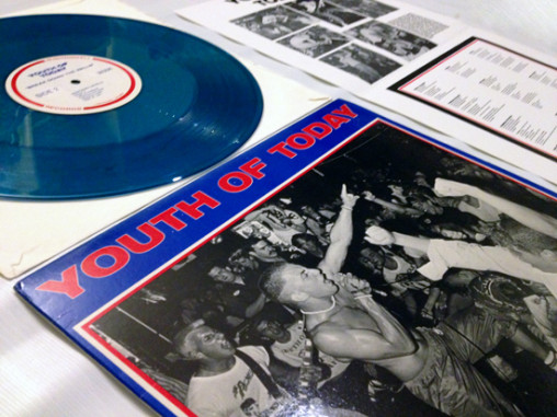
Photos: projectprojects.com X-ing up with a thick black marker, triple Xs or a single X on record sleeves, skin, buttons, flyers or clothes in all different forms thinkable…that’s…
Hangul – the Korean alphabet. Apart from the very simple, bold and geometrical basics of all its letters, I’m just amazed by how it can be used to…
Images 1-3 from merchnow.com / 4 harshforms Regardless of the flood of typography books in recent years, I still think that best ideas for typography are to be…


