Category: TypoPage 1 of 4
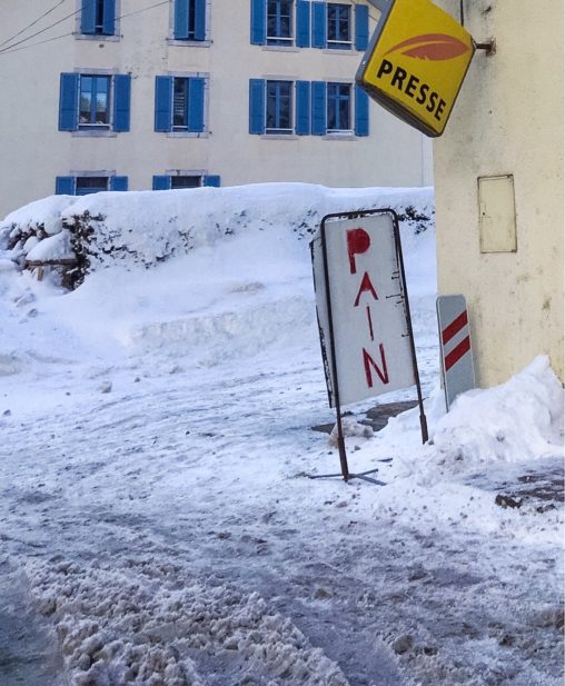
Advertisement for bread at a small kiosk in France. Finally managed to take a photo of both sides of the signpost.

I looked at this at least thrice. Layout done by Anthony Pappalardo. Photos from: jenkemvol1.com

I failed uncountable times in taking a photo of these. But Dominique Auerbacher’s photos are the proof that it is possible. In her series “Scratches” (2007–2009) she documented…


[1] Drawing for artist The Pizz taken from Garage Magazine No. 18; [2]; [3] ; [4]; [5] Cartooning humans was certainly a mayor aspect of Shawn Kerri’s work,…

“I’m basically a cartoonist,” describes Shawn Kerri (born Shawn Maureen Fitzgerald) herself. It is her passion for cartoons, “the most fun artform,” through which she made herself a…
It is the freestyle use of umlaut marks that makes me come back and have a second look at this logo from YMCafe, Seoul. Image from cafeym.com
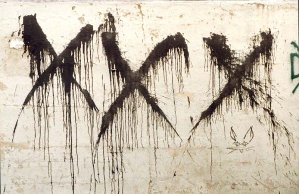
Photo by Karen Windsor – Wall close to Gallery East, Boston, from https://www.facebook.com/allagesthefilm

Gustave Doré is one of those 19th century artists that gained international fame while being alive. Especially British publishers loved the illustrations of this French artist and commissioned…

Anthony Pappalardo and I talked about his book Radio Silence. This is the third and final part of our conversation. This time around we talk about archiving hardcore,…
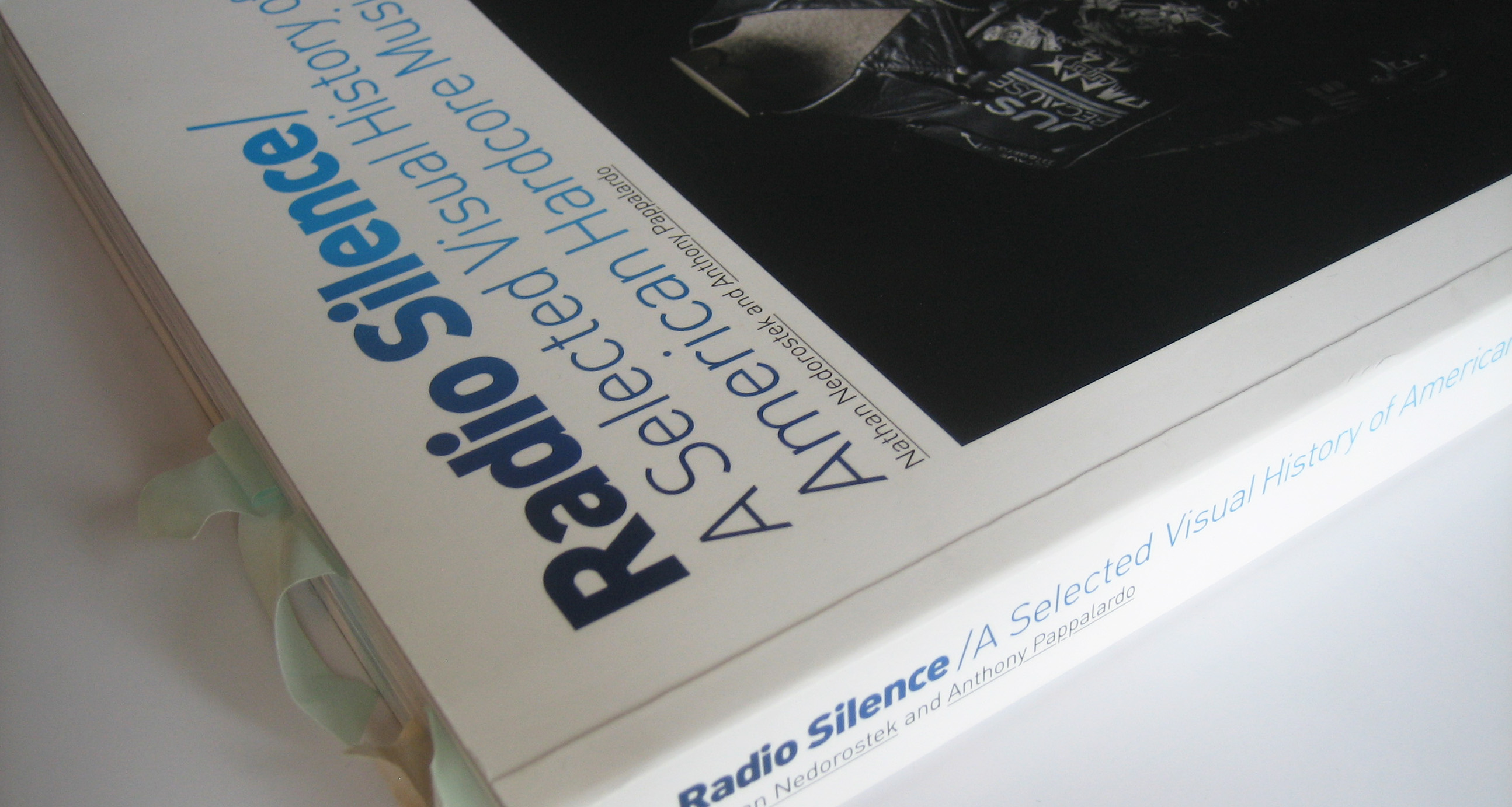
Anthony Pappalardo talked about his book Radio Silence with me. This is the follow-up part of our conversation —Part [1] is just here. —Part [3] can be read…
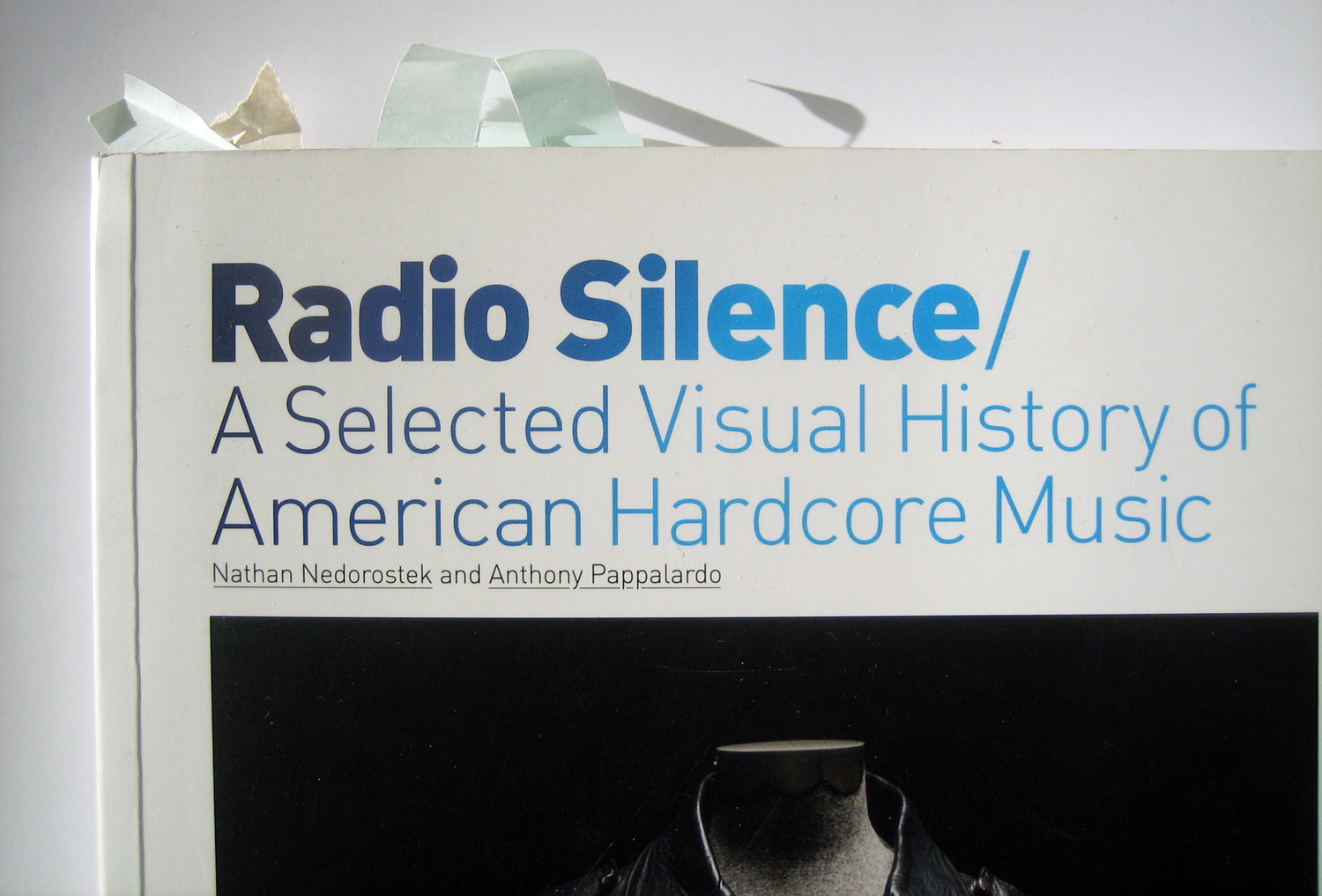
Radio Silence, published by Anthony Pappalardo and Nathan Nedorostek in 2008, is hands down the best book on hardcore. What makes it different from all other texts dealing…
As simple as it can get. Like the exterior of their Manhattan location.
Sometimes I’m stuck in the ’90s. Some PME. Images from 90bpm.net/forum, home.ekosystem.org and ekosystem.org/forum

Images from (1) doublecrossxx.com, (2) forums.livewire-records.com Chain of Strength were not only hardcore hipsters, which earned them the nickname of The New Kids on the Block of Hardcore…
This is the test. I got this record as a surprise present the other day and couldn’t wait to come back home to listen to it. But then…


This was like a treasure hunt. Even better. Kevin Crowley, singer and designer of New York Hardcore legend The Abused and also inventor of the New York Hardcore…
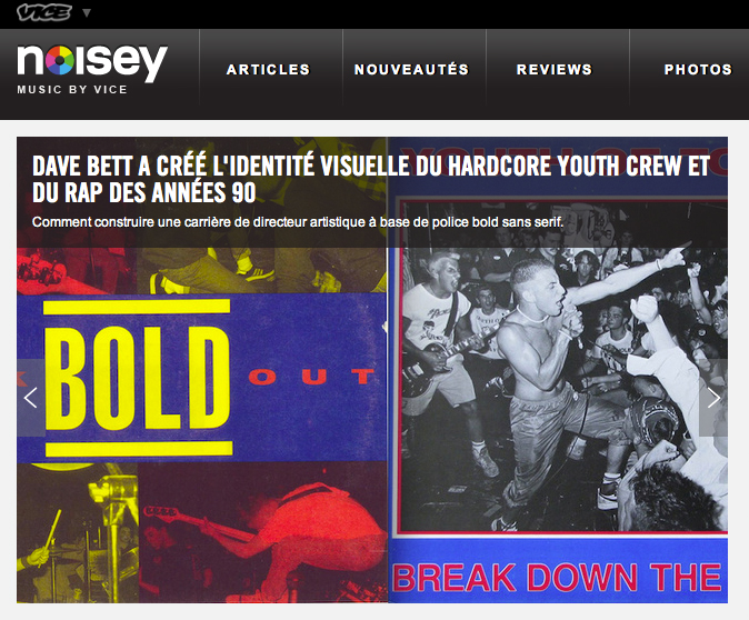
Some entries of my hardcore(-punk) layout series will appear on Noisey in French from time to time. They first one is up. Thanks, Rob.