
Images: (1) shavedneck.com, (2) obeyclothing.com/blog, (3) dementlieu.com
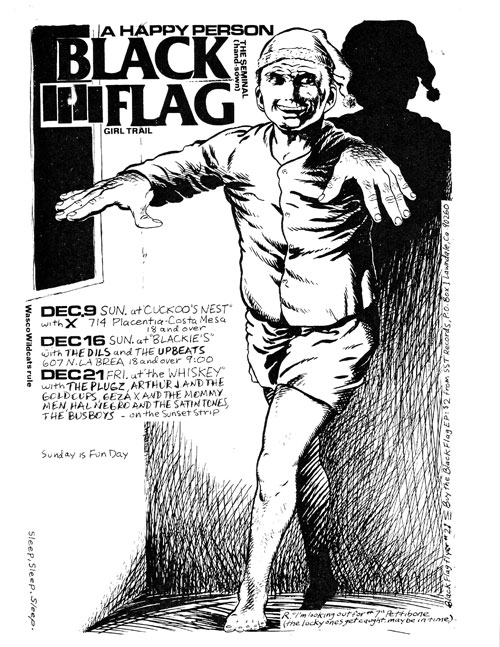
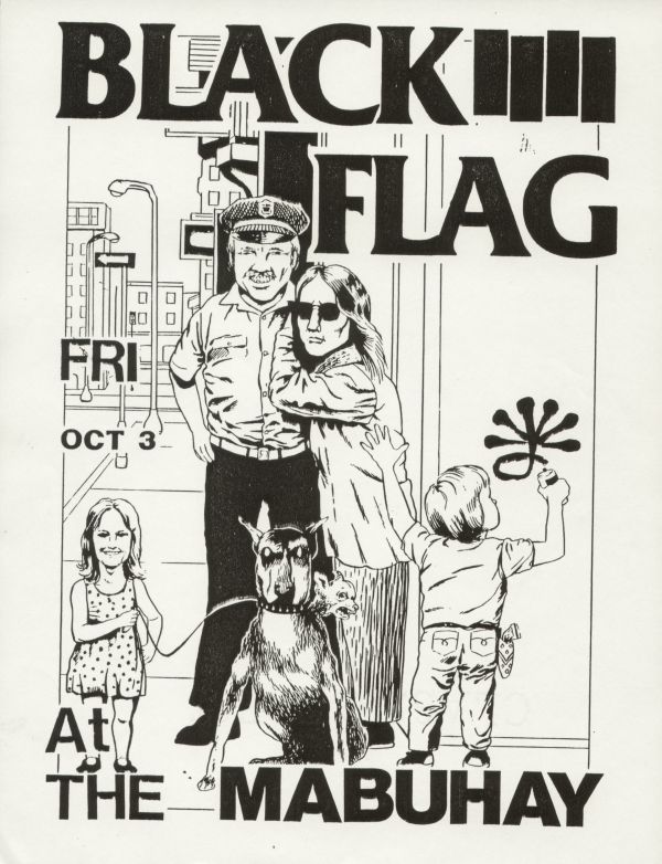
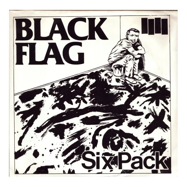
It was quite an awkward sight at MOCA’s Art in the Streets exhibition to see flyers for Black Flag shows framed. However, this might seem less bizarre if you consider that a set of 12 was sold at Christies for $2500 in 2008 and flyers sell from $300 to $400 each online. All these flyers were illustrated by Raymond Pettibon – another person behind todays classic hardcore layout. No. 2 in my follow-up series on hardcore(-punk) layout.
Now an established artist with his works being part of collections of the MoMa, MoCA, the Tate Modern, the Centre Pompidou, and a lot others, Pettibon is also well known for his illustrations for Black Flag flyers and covers. In other words: Without his illustrations Black Flag would have been something different.
Images: [1] wikipedia.org, [2] wikipedia.org
Pettibon, brother of Black Flags’s founder Greg Ginn, is also credited with suggesting the name to the band, which was formerly performing as “Panic”. Additionally, he came up with the four bars logo. For some, this logo supposed to be an abstract form of a moving black (anarchistic) flag. “If a white flag means surrender, a black flag represents anarchy”, he is often cited even though the source of this comment is untrackable (Azzarad writes something similar in his book Our Band Could Be Your Life though, p.19). For others, the Black Flag logo was inspired “by a handful of Blue Note Records covers”, as writes Anthony Pappalardo.


Whoever came up with using the font Friz Quadrata Bold for writing out the bands’ name is not stated anywhere.
The long lasting impact of the logo is reflected in its multiples parodies and copies – the 7th Letter shirt is the most convincing for my part. Other people amuse themselves to find the Back Flag logo in all sorts of different places like food, barns or windows. There is also the bookproject “Barred For Life” in the making (or on hold?) to trace people with the inked logo.
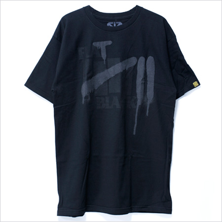
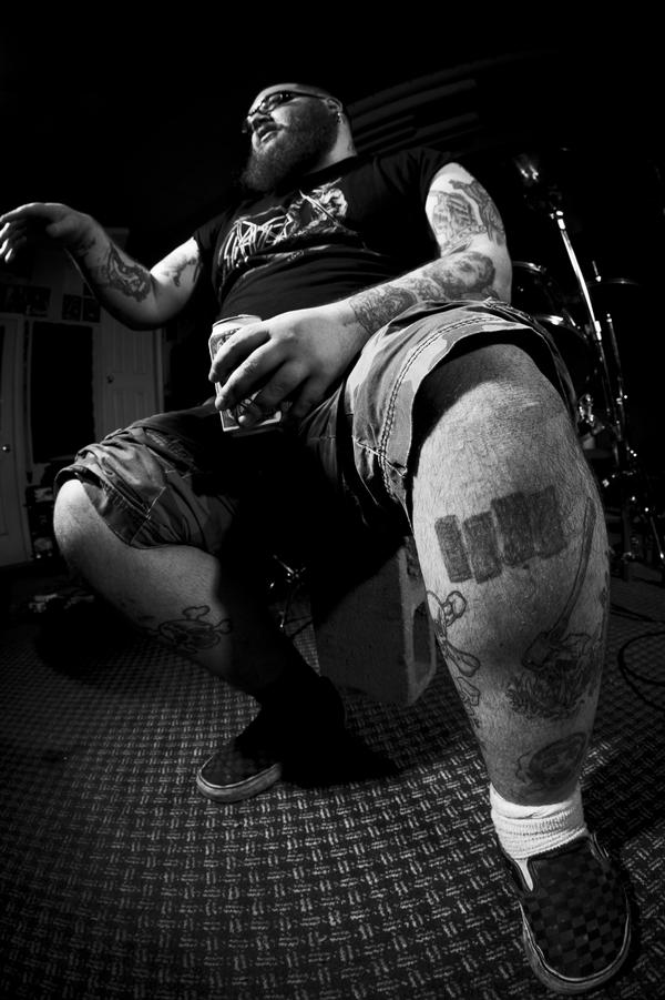
Images: (1) 7th Letter Shirt from rakuten.co.jp, (2) Photo by Jared Castaldi for and from barredforlife.net/photos
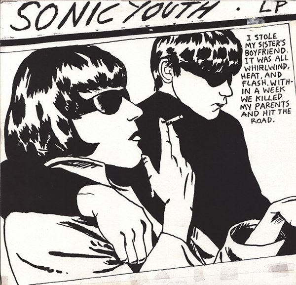
Even if Black Flag is always mentioned, most information and interviews about and with Pettibon do concentrate on his recent work and less on his illustrations for hardcore flyers and covers or the zines he put out. He nevertheless always kept on doing illustrations for album covers: “I still do covers if I’m asked and can get around to it at all”, he told crasierfrane. The best known cover other than for Black Flag or any STT band is probably the one for Sonic Youth’s “Goo” (1990).
Images: (1) straightandalert.com, (2) sonicyouth.com
Pettibon himself doesn’t make a clear connection between his art and hardcore (he speaks about punk). For him, these were two separate worlds: “I was making art and I was there. It’s like division of labour. I can’t play guitar or drums or anything”, he states in an interview with crasierfrane. This resonates in an interview with Steven Cerio when asked about his ties to punk in 2010 he answers “Well, I just knew these people. They asked for work and I did it.” This “non-relation” is surely due to the fact that there was no real established lay-out for hardcore bands at that time. In an interview in 2005 with believer mag Pettibon explains:
“The art preceded punk. (…) Music was one thing and art was another, and there weren’t really any standards for my art. If you look at old punk album covers they were mainly Russian constructivist or Heartsfield collages. There was no defined punk look or style. Not in art at least. Maybe in fashion. My work was just drawings, and basically drawings just as I would do now. They weren’t done with any aspirations of becoming a part of that scene. They weren’t about punk. They were just collections of drawings, some of which I xeroxed and sold.”

Photo: Black Flag live at Polliwog Park, Manhattan Beach end of 1970s from mrowster.wordpress.com
But there was another reason: Pettibon always saw himself as an artist, his works as art and not a mere illustration to express hardcore, the music and its message on covers or flyers: “To me my work was the equivalent of a band like Black Flag or any other band who was righteously self-protective of recordings. I would give them original art”, he says in an interview in the book We Got the Neutron Bomb.
This self perception is very much in contrast for example with David Bett who did a lot of layout for Revelation Records and whose graphic designs had to reflect hardcore. The only resemblance of the work of these two is the use of uppercase letters – but here again Pettibon used ink instead of computer fonts, which Bett used. Written uppercase letters are still a feature in Pettibon’s current work:
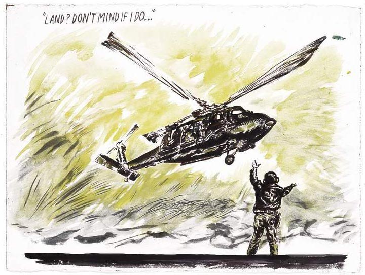
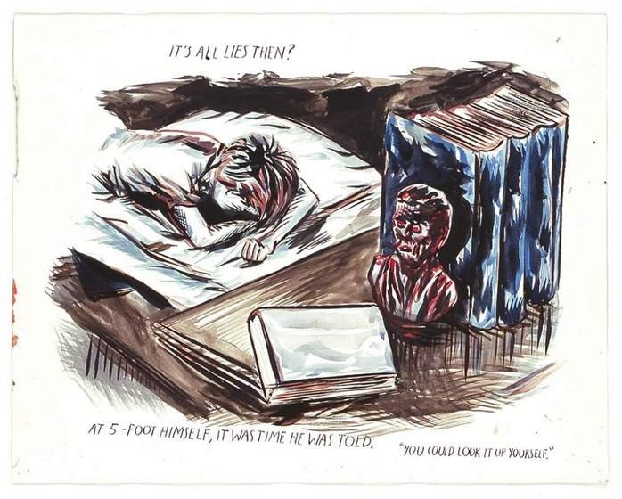
Images: raypettibon.com
More
/ Going to the beach with Raymond Pettibon: Daily objects signed Pettibon
/ Raymond Pettibon’s page
/ Raymond Pettibon on artnet
/ Interview by Eric Nelson about zine-making
/ New York Times article on Pettibon
/ PBS film featuring a really interesting sequence with Pettibon (minutes 15-28) and some more Pettibon on PBS / Video on Black Flag’s art on MOCAtv channel on youtube (22min)
Billy
cool web page…the top one is from my collection.
here’s a facecrack link with some others
https://www.facebook.com/befoot/media_set?set=a.10202881120041793.1016001751&type=3
Cheers, Billy Bee