Category: TypoPage 3 of 4


Photos from the exhibition “Riot to the Sound of Their Own Desire: Punk Feminisms” held at Interference Archive in Brooklyn, NYC, end of 2011. Growing out of the personal collection of…


Some more clenched fists: Three covers of “Ain’t I a Woman? A Midwest Newspaper of Women’s Liberation” – a newspaper published from 1970-1974 in Iowa City, US. Images:…
Logo for one of the coffee sorts Handsome Coffee Roasters from LA offers. I guess it is no coincidence that one of the guys behind this Coffee Bar…

Like these two designs lately. Reminded me of one of my favourite show flyers ever: Flyer Empowerment show from deutschpunk.blogspot.com; tape from http://de-de.facebook.com/druckwelledesign

Scott Magrath is the best example for why I started my on-onging series about hardcore layout. He’s one of the persons who craft the aesthetics of hardcore and…
Images: The Abused cover from vinylnoize.com; show flyers from myspace.com/theabusednyc/photos Kevin Crowley, singer and drawer of The Abused, is a reference for quite a number of people when…

Limited edition vinyl by Liars for their WIXIW album designed by John Wiese. It was dipped into black wax by the band members (filming themselves) into which the album’s title…
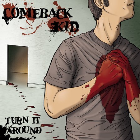
Images from lastchanceillustration.com Meet Michael Bukowski, an illustrator for bands like Shark Attack, Poison Idea, Poison the Well, Strength Approach, Comeback Kid, Your Demise, Donnybrook, Casey Jones or Most Precious…

This was minimalism by constraint: online mail order catalogs of Revelation, Dischord and Victory Records from the mid-1990s I had saved. This minimalism is back since some time…

“Friends and family”, a recurrent trope in Death Threat’s lyrics, also holds true when it comes to their layout. It was all done by Noah Butkus, the younger…

My friends from Life As War released their EP “To Tell You This” on vinyl on Inhumano Records a couple of months ago. The images were drawn dot…

Scratched letters always remind me of Brecht’s poem “The Invincible Inscription”. A scratched slogan on a wall which resists all attempts to erase it. It’s painted over two times…
In his ongoing project swissted, Mike Joyce takes old hardcore/punk flyers and sets them in International Typographic aka Swiss style – a style developed in 1950s Switzerland, which builds…
Images from grog-eu.tumblr.com

Personal name stamps, traditionally carved into stone or wood and stamped in red, are still regularly used in Japan, Korea, China and Taiwan to sign official documents.Above some…

Crass equals Gee Vaucher as Black Flag does Pettibon. Vaucher is the one responsible for Crass’s artwork. Rather punk than hardcore but thrilling enough to be no.3 in…
I finally saw Rotting Out the other day and it turns out it’s a good illustrator friend of them who does and did all the layout including their…
Images: (1) from fontclub.co.krdesigned by Kim Hye-jin in 2000, Typeface: Univers 57 Condenced(2) frommyasiancinema.com