Category: TypoPage 2 of 4
Tapes — (mostly) hand drawn and hand written inlays and done by band members or friends of them. The exhibition “Demo-lition,” put together by Freddy Alva (Wardance Records)…

This flyer has never been released. It was an alternative to the second flyer Kevin Crowley drew for The Abused. Together with Crowley, I’m working on a series…

December 28th 2013 marked the start of a three day long general strike in South Korea. The strike was aimed against government measures, especially the move toward the…

Kim Rense’s business card and both sides of Lik+Neon’s that I took with me in 2008. Image (1) from instagram.com/papanatos
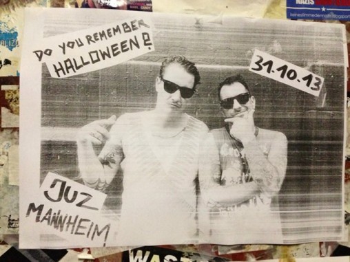
This could make a top 10 in best show ad. Image: deutschpunk.blogspot.com
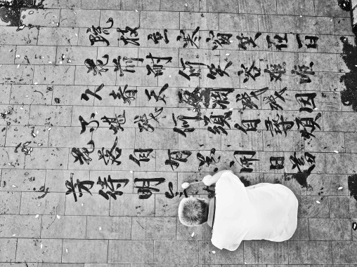
Photos (2)&(3) from francoischastanet.com, (1,4) from dokument.org A bucket of water, a brush and pavement. These three things make up dishu or “writing calligraphy on the ground”. Art…


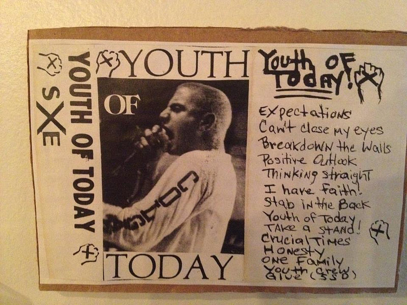
This cover represents one of the best summaries of straight edge: “Straight and ALERT”. It represents the envy I had of friends who sported their “Screaming for Change”…

Songzanlin Monastery – a Tibetan Buddhist monastry in Yunnan province, China. Photos via martinschulzephotography.com

A treasure: a monthly updated collection of Britcore jam flyers from the late 1980s onwards put together by Underground United. After some years of silence, some of the…


Cut by Fuzi Uv Tpk on the title cover of this book “Ma ligne”. Images from vforvandal.com
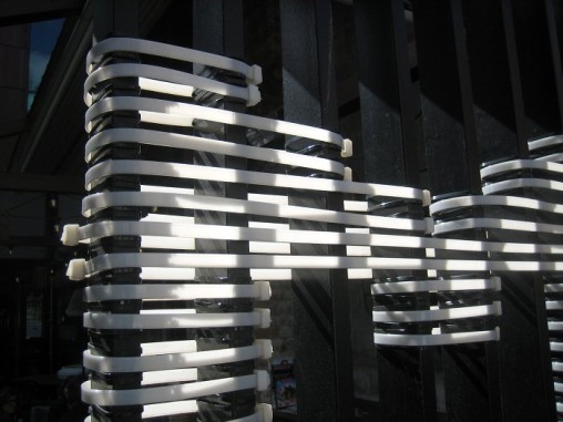
Entrance door from restaurant dishoom.com in London’s Shoreditch that I passed by the other day. Cable ties help out here to make their name be seen.
Call it street workout or calisthenics. Important is, that it’s happening right now. Teams being created, competing and setting up identities. These are the logos of the most…

Posters for calisthenics/street workout meetings in London designed by Benjamin Wachenje. I like this reviving of 1960-70s African-American graphical art. The first one purposely references the work of…

I finally got the DYS Brotherhood (1983). Apart from their classic Wolfpack, I love the cover – so it was just natural to write about it and make…

End of October every year people will gather with their DIY choppers and tall bikes at Bike Kill in NYC – organized since 2003 by the NYC chapter…

Dry stamps/seals should be used more often. Photos from: (1) Rice cake packaging bought in Seoul, (2) dry stamp of Barcelona based graphic artist mikeljaso-prints.com; (2) dry stamp on one of…

A long time since I saw some typography and was amazed like this.LP cover, limited ed. wooden LP box, cardboard mailers, batches and part of the booklet of…