
Images from (1) doublecrossxx.com, (2) forums.livewire-records.com
Chain of Strength were not only hardcore hipsters, which earned them the nickname of The New Kids on the Block of Hardcore – they designed their logo, t-shirts and records with as much sophistication as they chose their clothes.
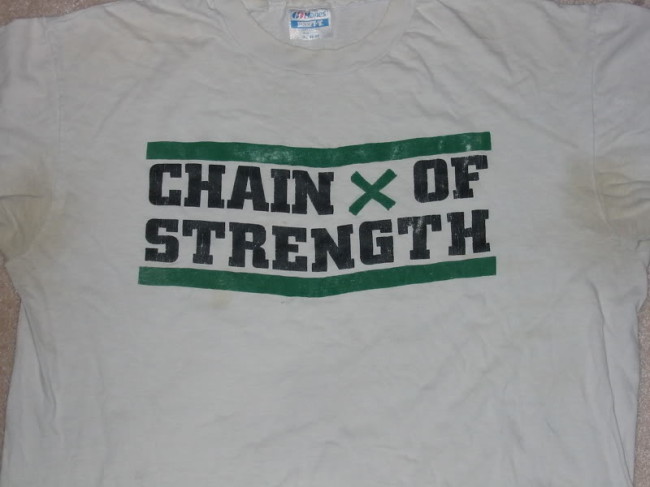
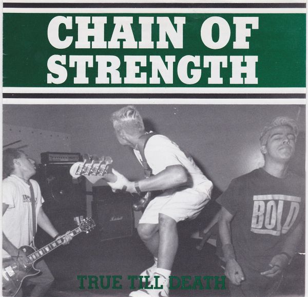
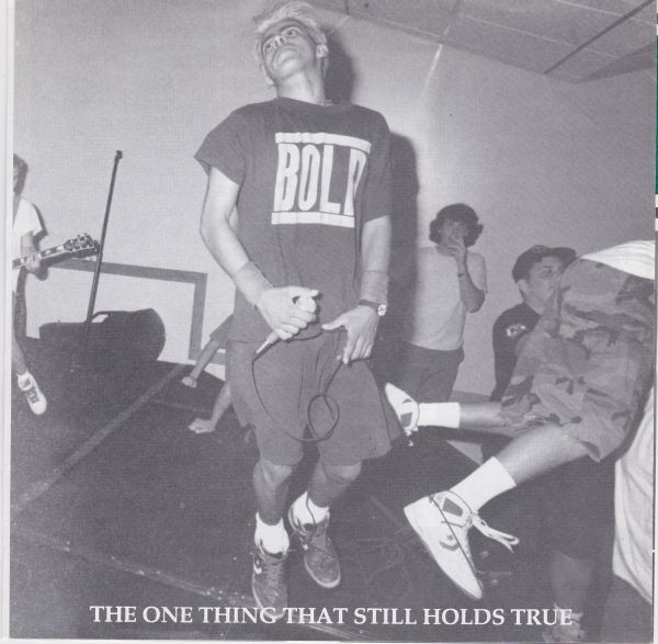
Clothes fanatics and merchandise kings, a t-shirt was also the first product that was designed by Chain of Strength. This happened to be the “True Till Death” t-shirt for their first show at the Yester Years Club in Pomona in August 1988 [photo above]. “We […] sold every one [of the t-shirts] in about 20 minutes. In any live shot from this show, a bunch of people all have them on,” remembers Chris Bratton.
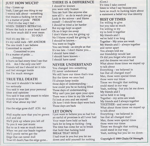
This t-thirt design eventually paved the way for their now very classic logo and cover designs. This holds especially true for the True Till Death 7″ put out by Revelation Records in 1989 where Chain of Strength had free reign on the design and on which I will comment here the most, next to the same titled t-shirt as there is not much information out there on the two other outputs.
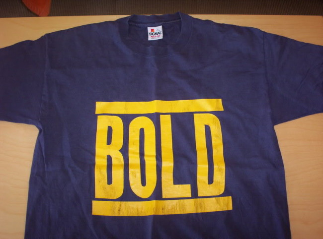
The design of the “True Till Death” t-shirt (that was also reprinted for the 10 year anniversary reunion show in 2013 and can basically be considered as their logo) was made out of a cocktail of different elements – most of them tributes to other bands: the SSD logo font Berthold City Bold, the bracket bars as “a common straight edge tribute to the immortal Run DMC,” as Chris Bratton explains in Radio Silence, and probably a little bit of Bold as well: “You gotta understand, that particular Bold shirt [t-shirt bassist Al Pain aka Alex Baretto and singer Curt Canales wear on the True Till Death record photos] was the coolest shirt in the country in a scene that’s really hyper obsessed with T-shirts,” so tells Chris Bratton Anthony Pappalardo at Vice.
![]()
Images from (2) upload.wikimedia.org (3) xshirtsx.blogspot.com
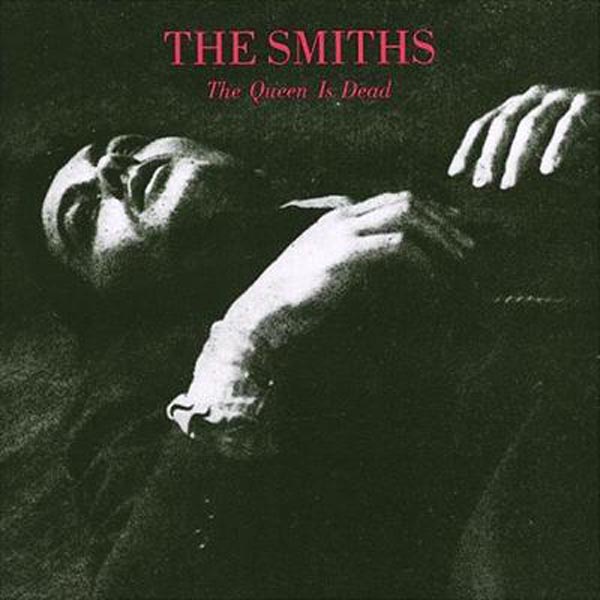
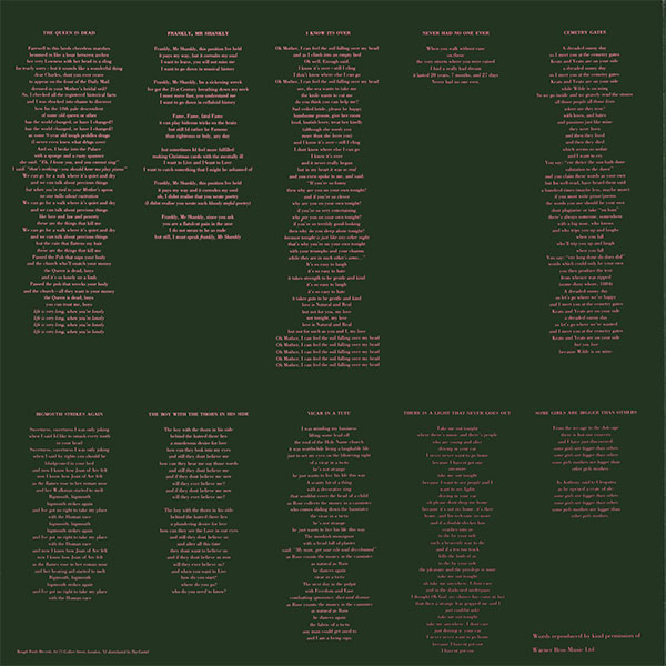
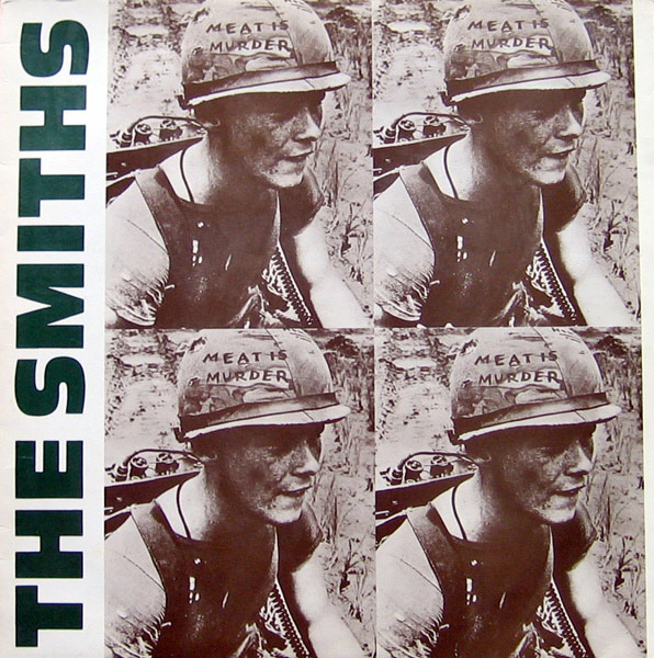
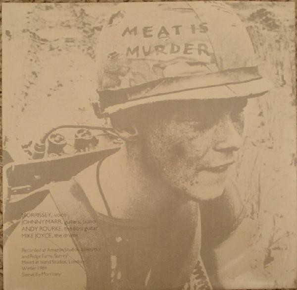
Chain of Strength’s “green theme,” how Bratton calls it and that can be found on nearly every Chain of Strength release, also debuted with this first t-shirt. It was inspired by Justice League’s “Reach Out” 12″ that was printed with a green border in 1987. Actually, this record made fun of the “anti-theft devise” used by Maxim Rock’n Roll editor Tim Yohannon to protect his records: green duct tape on the borders of his records. But the green theme was also influenced by the forest green used on the The Smiths’ records “Meat is Murder” (1985) and “The Queen is Dead” (1986).
However, it was only when Chain of Strength made the layout for the “True till Death” 7″ in 1989 that they definitely decided on green, white, and black to be their colors. Since then, they identified so much with these colors that drummer Chris Bratton still hates the blue “What Holds Us Apart” 7″ cover put out by Foundation Records in 1990. For him, it “looks like some other band.” Also guitarist Paul Hertz aka Frosty Crunch tells DoubleCrossXX that he had always considered this dark green as “Chain’s color.”
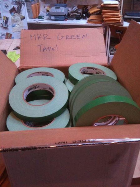
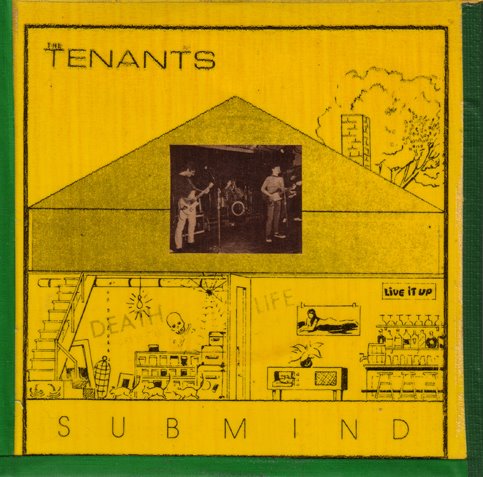
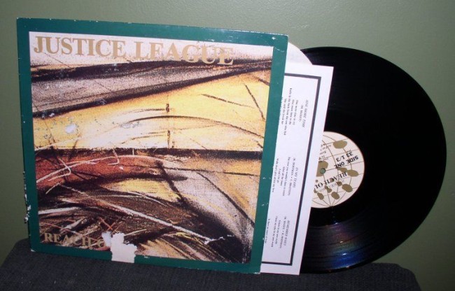
Image (1) MRR green tape from mbasic.facebook.com/maximumrocknroll, (2) part of Tim Yohannon’s record collection from maximumrocknroll.com, (3) The Tenants’ “The Submind” with MRR tape from maximumrocknroll.com, (4) from ebay.com
Not only the green but all the ingredients for the record layout of the “True Till Death” 7″ were very similar to the ones from the same titled t-shirt. Next to the green (that is, with white, also one of the vinyl colors), the bracket bars are there in a lighter version and the font (most likely Stymie) is very similar to Berthold City. Also, The Smith’s records played a huge role, again. In an interview with DoubleCrossX, Frosty also makes reference to Revelation Records aesthetic in saying that this record “really looks like a classic REV release.” However, the whole cocktail of influences is best summarized by Chris Bratton in his interview with Pappalardo: “The idea was simple: Glen E. Friedman/Philin Flash styled live shots with X-Claim! meets Revelation Records graphics, blended with the Smiths The Queen Is Dead and Meat Is Murder aesthetics.” The latter was not only appreciated for their forest green but also for their minimalistic typography and bleed-off illustrations that were basically copied by Chain of Strength going as far as taken up the composition of these two The Smiths records which becomes evident when comparing them:
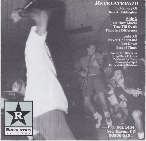
Last but not least: photos. When talking about the “True Till Death” record, it is impossible not to mention its photos. Everyone has a take on those. Actually Chris Ortiz, part of the Justice League crew at that time and now a skateboarding photographer, was asked to take live shots at Chain of Strength’s first show. But the deception set in right away: all negatives were scratched and not usable for the record design. One image still ended up on the back cover (scratches included). Without photos and without shows to play in the near future, Chain of Strength decided to organize their own show at Trojan Rehearsal Studio in Garden Grove, California. “We played a show just to get some pictures for our record,” as Chris Bratton summarizes.
This is also the reason why a lot of people are convinced that the photos for the record were staged. Whatever the stance is on this, one thing was not staged, but a real coincidence: both Bassist Alex Baretto aka Al Pain and singer Curt Canales showed up with Bold shirts on for the photo shoot and both Bold shirts ended up on the booklet – you know those t-shirts that were the coolest in the country at that time.
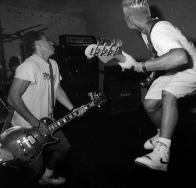
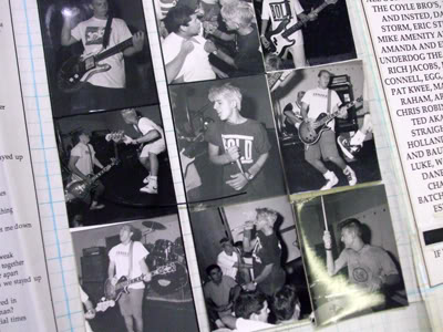
Image (1) True Till Death 7″ back cover with scratches, Image (2) True Till Death 7″ photo shoot, photo courtesy of “Rev Vault” taken from doublecrossxx.com, (3) original photo collage from the “True Till Death” 7″, photo by Tim DCXX from doublecrossxx.com
All record cover images in this post, if not otherwise mentioned, from discogs.com
Leave a Reply