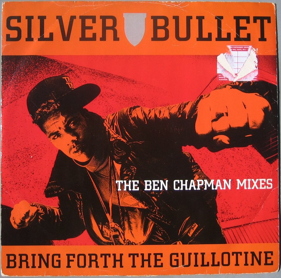
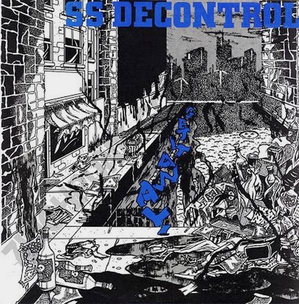
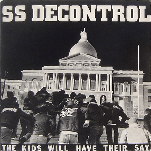
This is the test. I got this record as a surprise present the other day and couldn’t wait to come back home to listen to it. But then the layout caught my eye. The SSD font. Berthold City. In medium. If you like typography and hardcore, one of the first font names you’ll remember is for sure the one of this font. Whether you know it as the SSD font, the Youth Crew font, or simply by what name it goes by in typography.
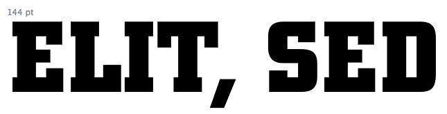
Berthold City’s history goes back to 1930s Germany. It was designed by German designer Georg Trump in 1930 when working for Berthold, a globally active, flourishing German typefoundry at that time with head offices in Stuttgart, St. Petersburg, Budapest, and Vienna among others. Slap serifs regained popularity after World War I for advertisement and City was released at that time as “a distinctive, rectangular design that evokes a sporty, urban feeling,” as stated on Berthold’s page.
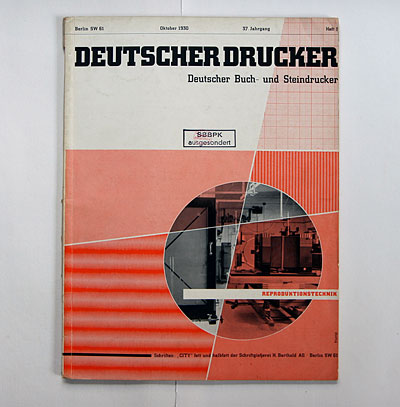
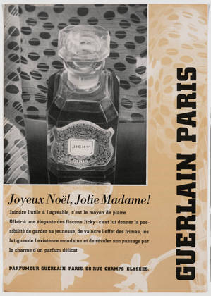
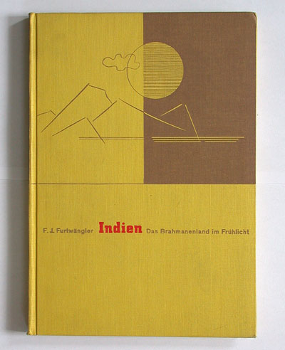
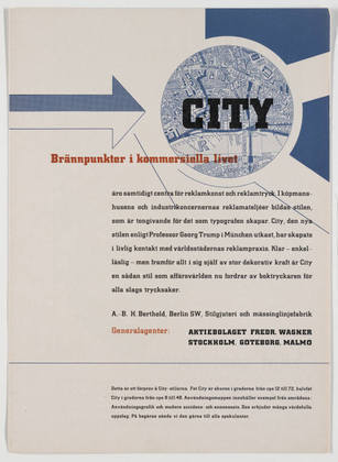
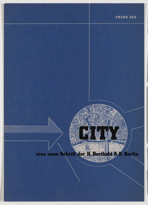
Images: Berthold City in use beginning of the 1930s: (1),(6) October Issue Deutscher Drucker 1930 from wiedler.ch; (3) Deutsche Büchergilde 1931 from wiedler.ch; (2),(4)-(5) c. 1931 from MoMA.org
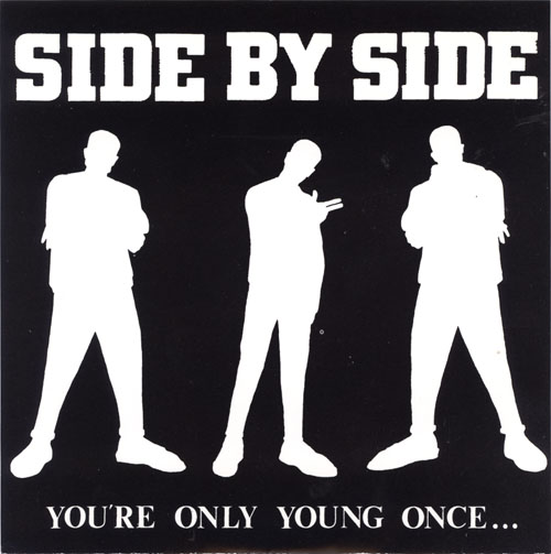
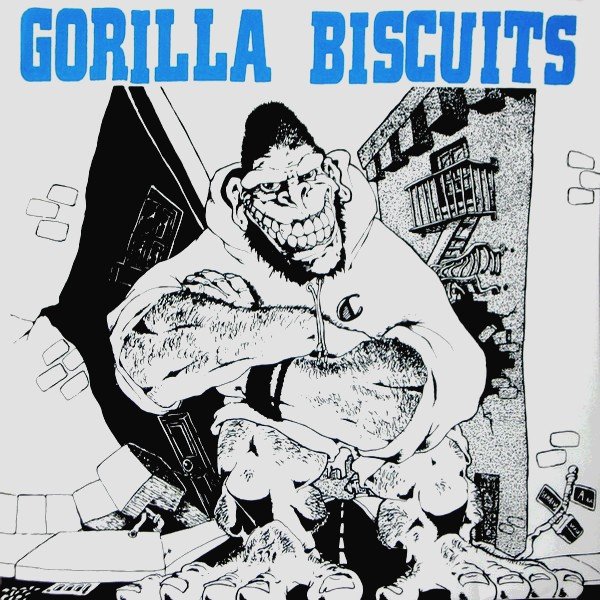
It is SS Decontrol that brought Berthold City in bold and with an upper case exclusive look into hardcore. But its real year of glory was 1988. At the peak of Youth Crew, a lot of bands used this font on their record releases as their logo font. Gorilla Biscuit used it for their ST 7″, Side by Side for their “You’re Only Young Once” 7″ cover or Chain of Strength (who explicitly name the SSD font as inspiration) sported it on their “True Till Death” t-shirts that they made for their first show in 1988. Also High Impact, Turning Point’s label in 1988, put out a t-shirt using this font that year. Berthold City thus became since then synonym with Youth Crew. A simple search “youth crew records” in any search engine will verify this.
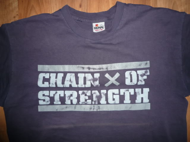
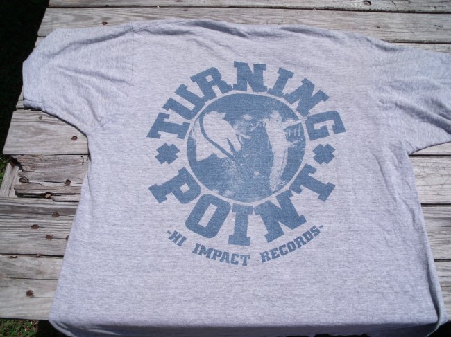
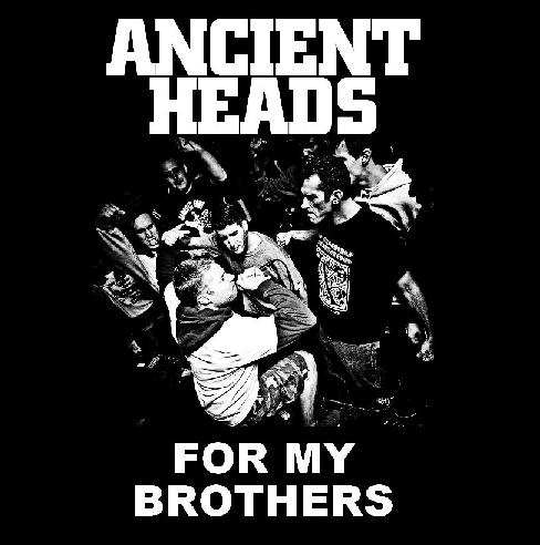
Images (5) Chain of Strength Shirt from xshirtsx.blogspot.com(6) Turning Point Shirt from teetilldeath.com, Clearsight record cover from store.deathwishinc.com, Ancient Heads record cover from shop.react-records.com
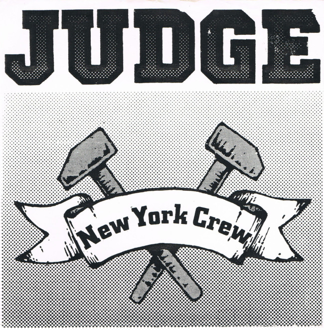
Another font that became indistinguishable with hardcore in 1988 was Princetown Regular. This only upper-case font was designed by British designer Dick Jones when working for Letraset UK in 1981. Since then it became a regular font for American high school and college sport teams.
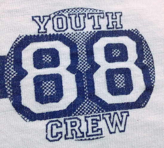
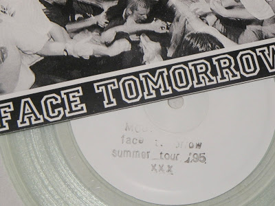
In 1988, Judge used this font for their “New York Crew” 7″ for their logo and it’s also the font on Youth of Today’s “Youth Crew 88” t-shirt that they made for their 1988 summer tour. Alex Brown did the layout and remembers that he wanted it “to look like some sort of team logo. I was really into the way the first couple of SSD records looked”, he keeps on and adds: “and I suppose that could be cited as a motive for the typeface I used; something bold and clean.”
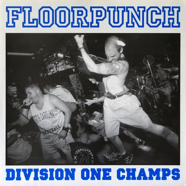
Later on, Princetown became, as Berthold City, another classic font for Youth Crew and straight edge bands. Think Floorpunch.
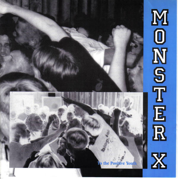
Fonts images from myfonts.com, if not differently mentioned all other record covers from discogs.com, youth crew 88 t-shirt from doublecrossxx.com, record cover Monster X from vinyl45lp.com, record cover Mouthpiece from recordnerdyo.blogspot.com
This post is part of series on hardcore(-punk) layout. The complete series so far can be found here.
Leave a Reply