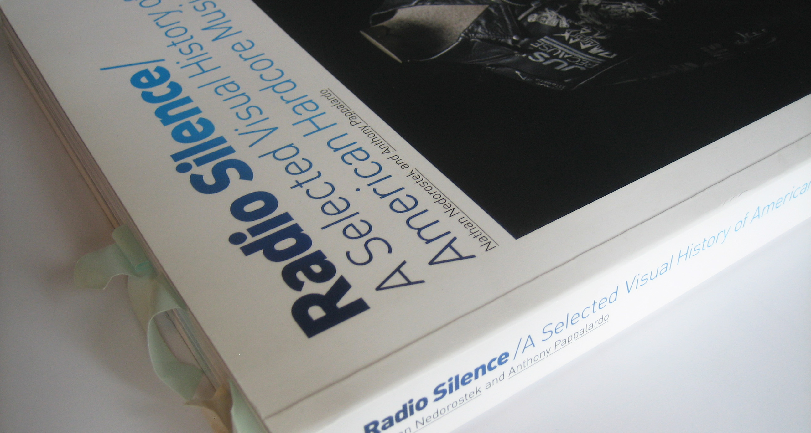
Anthony Pappalardo talked about his book Radio Silence with me. This is the follow-up part of our conversation
—Part [1] is just here.
—Part [3] can be read here.
Harshforms – We only exchanged about record covers until now, but obviously a record sleeve is more than that. Does anything come to mind when hearing back cover, booklet (it depressed me when labels started to insert CD inlets into vinyl sleeves) or vinyl (colors and messages scratched into it)?
Anthony – A lot of the people I went to college with had some type of punk or hardcore background—it’s not that random, as it was art school and in the ’80s and ’90s, if you were into underground shit, you probably dabbled in punk. A few of us were sitting around one day, spinning vinyl after a day of record shopping and talking about layouts. These were some heavy designers, who were light-years past cut-and-past flyers.

Two of them (Josh Hooten and Tony Leone) created a fantastic, but short lived fanzine called Commodity, that featured some of the best design ever to exist in punk / hardcore zines.
This was 1994 and we were talking about how package design—not just the sleeves—were being neglected with CDs. At that time, there were a lot of bands doing really ornate, handmade designed record sleeves, printing on paper towels, gluing shit everywhere, screen printing over old covers and creating new works, but CDs were so one dimensional and not interactive.
Eventually people would push that medium a lot more, but it’s just kind of a shitty format to begin with. I guess the Septic Death “Crossed Out Twice” CD / 5″ Pushead released is the best example or adding some life to CD design.
That idea of a record, tape, or CD as an object that you interact with was really important to me. It’s more than just an image to sell the music. It’s those little touches like the matrix etchings or how Dischord would write messages on the flaps of their 7″ covers before gluing them together.

[1] seekingthesimple.wordpress.com, [2] revhq.com, [3] “The best poster-insert” from: seekingthesimple.wordpress.com
It was always such a bummer to bring a record home and find out that the band or label didn’t even care to include a lyric sheet. If you got a mail order form, poster, or a booklet, that was amazing, especially when you’re young and broke—it’s more value!


I think Ebullition went a little over board with the inserts, not so much as the Downcast LP coming with a mini-book for an insert, but with all the little mini-zines and literature. I know the bands didn’t care, but I got turned off by how much Kent McClard was using someone else’s music as a vehicle for his musings.
I learned a lot talking with those guys about design and it really made me have a larger appreciation for the albums that used the cover as more than just something that the vinyl is housed in. That doesn’t mean that you have to pack some unnecessary shit in there, it’s more about the little touches.
turntablelab.com
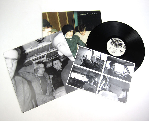
Fugazi’s Demo which was just pressed on vinyl came with postcards—I thought that was dope—or it’s as simple as being creative with the direction of the images or type, so you have to pick the record up to really see the entire image and digest it. And who can get mad at a big fold out poster? That’s always a win.
Harshforms – Leaving the records aside, you choose not to concentrate on record sleeves (as loads of other authors do) but rather to include them among other material objects—the cover of Radio Silence is quite telling in this respect. Letters, jackets, t-shirts, Krishna beads and skateboards—why this broader approach?
Anthony – Hardcore is a very unique genre in that the music isn’t the most important component. It doesn’t live on classic rock radio, isolated from its original context. Sure, if someone asks you what hardcore is and you play them The Fix, they’ll get it, but they wont GET it. It’s an entire language that’s so visual, to tell the story we needed to show more than flyers or covers.
There were so many things we wanted to include that we either couldn’t find, weren’t ever documented, or didn’t reproduce correctly, but they all told the story to us.
pinterest.com
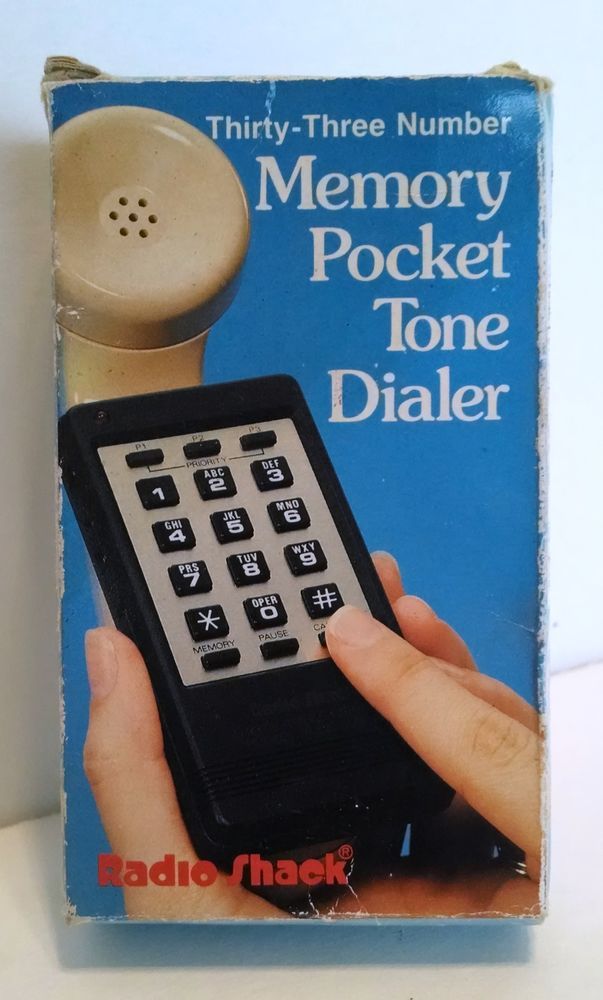
In the mid-’90s modified phone dialers were a big deal. You’d get these things from an electronics store for $15, mod them out so that they could reproduce the sound of a coin going into a payphone, and be able to make calls for free. That meant that phone bill you’d normally rack up booking a tour or just gossiping or whatever was now free—that was huge. Now a photograph of one isn’t too exciting, but that was such a part of hardcore and part of the story.
Skateboards were a no brainer of course, but we never got good pictures of “hardcore cars,” which were big with the suburban set. It might have been as simple as putting stickers all over your bumper and rear window, but you wanted to let other kids know what you were into. I remember seeing a Uniform Choice sticker on a car in my town’s mall parking lot and tripping out, because no one in my town was really into hardcore. Whoever was driving that car knew something and I wanted to know who the hell they were.
So it’s the music, the zines, the inserts, the graffiti, venues, even the instruments. It was all so different than what was happening in arenas or in some rock n’ roll venue and was so much cooler to me. It felt authentic. For real, what kid actually wants to buy all that shit that a Mötley Crüe fan would have to own back in the ’80s? It was such a pain in the ass and I never thought it looked cool at all. Hardcore was easy, I had a pair of Vans, I wore blue jeans, and I’d buy a band’s shirt if I dug them. Done and done.

Harshforms – Getting back to what you mentioned before, that hardcore is not an aesthetic but more than that: I just talked with someone about nostalgia & objects (she is a DJ and into jazz/rap). When I read your last answers in which you mentioned the “hardcore cars,” the phone dialers, etc., I immediately became nostalgic and started to think about other objects: wallet chains, patches and pins, but also mix tapes gifted by friends who spend hours on making them and creating the inlet.
So, of course, I’m curious which other objects you didn’t include in Radio Silence? Which were the ones you couldn’t find?
Anthony – It was tough to find those banners that bands would hang up as few really survived. The Token Entry necklace or Dag Nasty “Dag Tags,” would have been killer too, but we couldn’t unearth any. Then again we got the Teen Idles jacket, so fuck it! We actually photographed some silk screened arm-bands that Jeff Nelson made way back of some Dischord bands, but they didn’t make the cut.
We started off with a pretty ridiculous list of ephemera—anything we could think of. So you could imagine what was on it: A hat from HR, Mike Judge’s construction gloves, the skateboard and Drug Free Youth jacket from the Abused 7″, Springa’s homemade Meatmen shirt, etc.
We got pretty close on a lot of it and really should have been able to get the Judge gloves and Abused jacket, as they’re pretty accessible, but travel was a huge issue and we couldn’t settle for having someone take a crappy cell phone pic—it all had to be done in one consistent manner.
There were also a lot of things that are cool in theory, but don’t really tell a story when you reproduce them. For example, we came upon several recording reels for seminal albums, but they aren’t that exciting to look at. Some tape with some writing doesn’t really do much and when you have to cut images, you need to go for what’s more exciting.
One last thing I thought of that we never found was an original, hand drawn Suicidal Tendencies marker T-Shirt, which surfaced a few years back on eBay. Dan from Excel was selling his and I did a little write up on it for VICE.
thrashermagazine.com—screenshot
Harshforms – Radio Silence is a project focused on North America —as its subtitle (A Selected Visual History of American Hardcore Music) already indicates—; kind of as if hardcore only existed there. Now I was astonished when you told me somewhen else that you also have Japanese stuff in your collection and touring with Ten Yard Fight and In My Eyes should have acquainted you also to some “overseas” stuff. How come you decided to limit your book to North America?
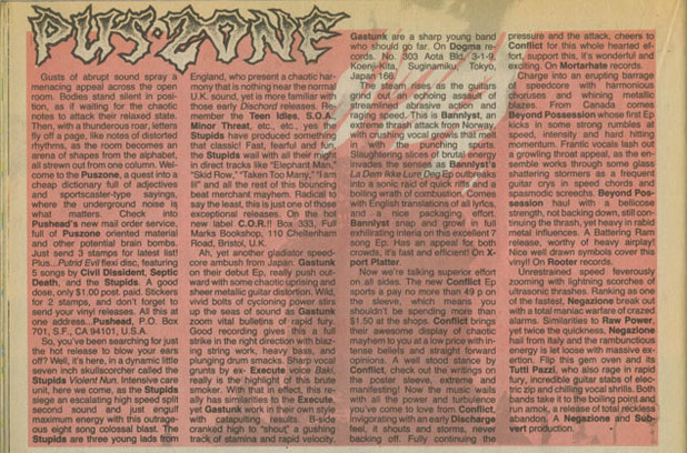
Anthony – By reading Pushead’s Pus-Zone column in Thrasher I’d learn more than just US releases and everyone was always interested in UK punk of course, but then you get little bits that trickle down, Sore Throat, Concrete Sox, Discharge, Larm, Gism, bands you’d hear through other people or just by recognizing their names from a review. Also, when Todd Burdette from Tragedy lived in Boston in the early ’90s and was playing in Arise. He was such a collector and student and turned a lot of people onto international bands and obscure stuff.
Ultimately, what I was the most passionate about was US hardcore. I was so obsessed with finding all those LPs and singles, that caring about Lip Cream records or whatever KBD thing was hot at the moment wasn’t what excited me, plus that shit was so hard to find. At that time in Boston, there were so many stores and it was common for college kids to sell off their collections, because college kids are broke, so you could find tons of records. I was lucky enough to have a lot of people turn me onto different things, so you’d just venture out and see what you came back with. When I moved into my second dorm room for the last half of my Freshman year, it felt like everyone was so diverse. There was the jazz guy, post punk dude, psych rocker, indie rock guru, riot grrrls, and just all types of sounds happening, so you could pop into someone’s room, hear something new and then make a mental note when you went shopping. Sometimes you’d return with an Unrest 7″, Ornette Coleman LP, some random promo cassette for Archwelder or whatever indie band had a record coming out, a beat up copy of a Dickies LP, and a Side by Side 7″ that the store owner didn’t know was rare and priced at $3.00. Nostalgic tangent, right? It was just a different trip, because you had to go buy music and there were so many stores, some were good for just one thing or whatever, so we’d make these day-long missions just to learn about music in general, not just punk.
For Radio Silence, we had to set up some guidelines or we’d still be working on the book and no one would have published it. Print is hard to sell. Even those who are passionate—the people who will spent $1,000 on a Misfits record—will say, “Oh man, $50 for that book…. that’s steep” and never buy it. Sure it would have been cool to do an 800 page encyclopedia, but it’s not really feasible and certainly wasn’t then.
The narrative I came up with was that this was a book about the evolution of American Hardcore, pre-digital. That’s it. It gave us a storyline and framework to follow, in order to make it purposeful and not just a bunch of images thrown on some pages without context. If you read the opening essay, I think it’s pretty obvious why we kept those parameters. When you’re talking hardcore, everyone scene and time frame can and has filled its own book, so if we added in Europe and Asia one of us would have had a nervous breakdown—it’s just too much. Plus, can you imagine the scrutiny we’d be under to document overseas bands, where most of the stuff never made it to the US? It would have been amateur and difficult to really capture it. Instead, we wanted to document something we felt and saw, even if we weren’t going to the Gallery East in 1980.
Leave a Reply