
This was like a treasure hunt. Even better. Kevin Crowley, singer and designer of New York Hardcore legend The Abused and also inventor of the New York Hardcore logo, took the time to talk about his artwork with me.
His artwork is extremely rich with references and Crowley has an abundance of stories to share about it. All of these stories revolve around a larger story arch: New York City Hardcore. They are about Crowley and his buddies, their inside jokes, the films they watched, the political issues of the time that they were concerned about, the issues of the hardcore scene at the time, and 1980s North American pop culture. All of this comes alive when Crowley talks about his drawings.
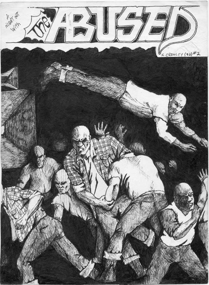
But as much as Crowley’s artwork tells a story about hardcore back then, it also tells a story about hardcore today. I was amazed about how much Crowley communicated with his flyers – not something one could say about flyers today. Crowley’s flyers are like one-page mini-fanzines that carry story lines from one to the other and open up a whole universe when looked at together. Crowley’s flyers also demonstrate the locatedness of hardcore in time and place and how it is changing and evolving over the years. Some references and sayings will not ring familiar to someone from a younger generation, some places are only part of the collective memory of hardcore kids but other issues will be as up-to-date as in the 1980s.
Crowley speaks about all of this with reflexive closeness. Sometimes ironic, sometimes serious, sometimes very detailed, sometimes through fragments of memories, sometimes thoughtful, sometimes with a tongue-in-cheek.
This will be a series of posts. In this one I will mainly concentrate on the universe Crowley invented for The Abused and the characters that populated it: Captain Hardcore, Mr. Softy and Ronny Rotten.
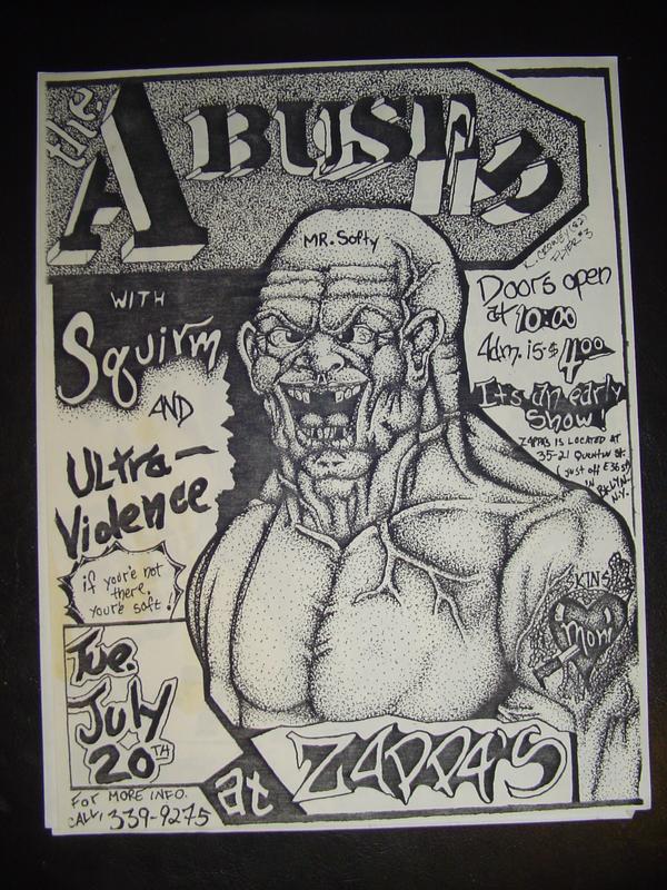
Everyone who takes a closer look at Crowley’s artwork will quickly notice that The Abused was a very thought through, thought out product and nothing was left to hazard. The Abused was a marketed product. “Just because it was DIY doesn’t mean that there isn’t marketing strategy being used,” resumes Crowley when asked if he thinks that hardcore bands used branding. He tells me: “With the Abused flyers there was a very conscious effort to portray us the way I wanted people to perceive us.” “I felt that if we created enough hype about the band,” he continues, “we would build a following even if we ended up sucking (which thankfully we didn’t). That’s why I made the coming soon flyer…to hype us…well before we even had a gig booked.”
The branding had a direct influence on the look of the flyers. For the first of the The Abused flyers (on the left) Crowley used a hatch technique for shading. He started to draw a second flyer (right) in the same technique but changed it up to another flyer he drew in pointillism technique that later on became The Abused’s trademark look. “I felt the pointillism, although more tedious, gave me the ability to create greater detail,” tells me Crowley and adds: “I also did’t see anybody else using a similar style at the time, and felt this could help “brand” the band.” Crowley thus observed keenly the graphic landscape in hardcore of the time and wanted to distinguish himself already by the way he drew. But there was another way he wanted to arouse interest in his band: “Most my flyers were dominated with aggressive male imagery,” says Crowley, “which was less about girl/boy roles and more about my own psyche and a little bit of marketing. When I was in my teens I was 6’3″ and probably weighed 150 lbs soaking wet. In other words, I was pretty skinny and nowhere near as muscled as my drawings. In a strange way, drawing such strong characters helped strengthen my character (if that makes any sense). I was projecting on paper how I wanted other people to see me (as a performer), and the band.”
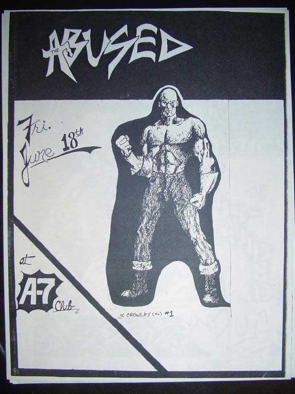
CAPTAIN HARDCORE
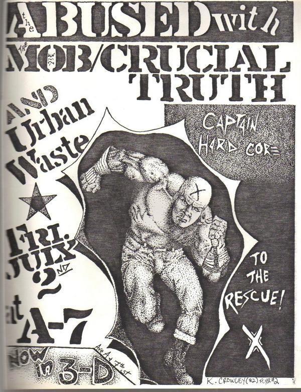
“Doesn’t every subculture deserve a super hero?,” asks Crowley. It is on Flyer 2 that Crowley introduces Captain Hardcore that should become the most important of his characters, reappearing on Flyer 7 and 10. The easy guess would be that it is a transformed Captain America. But “Captain Hardcore was not only a reference to Captain America, but the whole super hero genre,” explains Crowley. As every super hero, Captain Hardcore has a special power besides being able to “pretty much kick anybody’s ass”: “His real strength was in saving us from the mediocrity of main stream music/pop culture. So essentially, he was a visual metaphor for hardcore music in general.” His force was shown by him being 3D and “bursting through the paper.” (The “Now in 3D” reference was also a reference to the worldwide resurgence of 3D films in the 1980s). The personage of Captain Hardcore was “not based on anybody in particular rather an ideal masculinity that a teenage boy (me) could identify with. I had toyed with the idea of creating a background story for him and creating a comic strip but didn’t pursue it.”
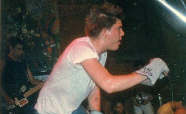
But Captain Hardcore’s attire was not all Crowley’s imagination. The gloves Captain Hardcore wears became “representational of what I was wearing in real life,” says Crowley. They were “functional wear” as they would protect his hands in case of a fight: “They were durable, cheap and easily gotten at any hardware or ‘Army Navy’ store. I think originally, I ‘borrowed’ a pair of my dad’s. They also happened to be cool looking and very utilitarian.” Later on he “upped the ante” and started wearing welding gloves (which are bigger) and he drew/wrote on them to personalize them. Another accessory that Crowley and some of his friends wore and that Captain Hardcore wears on Flyer 10 and that are also featured on the “Loud and Clear” cover are heavy duty chains. These belts could be used for self defense and weren’t “considered a weapon by the cops.” But the chains were not only representative of Crowley’s own style but became, in his art, a “symbolic of societal bondage.”
MR. SOFTY
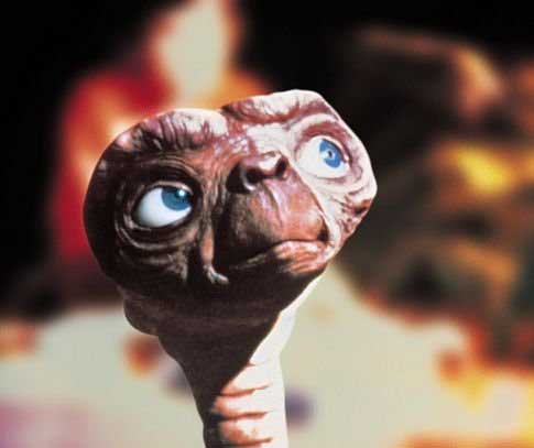
(1) Comedian Don Rickles as C.P.O. Sharkey from en.wikipedia.org, (2) E.T. from imdb.com
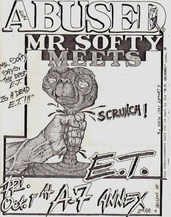
Another character that evolved around a certain masculinity was Mr. Softy, a character that Crowley introduced on Flyer 3. It was meant to sarcastically comment on being “tough punks” – best summarized in the flyer’s slogan “”if you’re not there, you’re soft!.” “I think no matter how much we postured about how tough we were,” Crowley says, “I needed to keep things in perspective and not take myself too seriously.” Mr. Softy’s name came from opposing everyone’s comments on “how ‘hard’ something was, or that someone was ‘soft.’” Also, in the same vein, it made reference to Mr. Softee (with double e), which was a popular soft ice cream brand at that time.
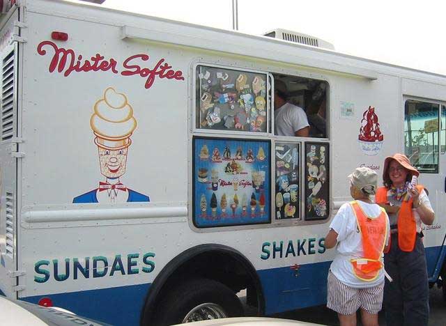
Mister Softee van from mistersoftee.com
Crowley drew Mr. Softy to look “mega tough.” First he didn’t have a specific image in mind. While drawing, the character turned out more and more like Don Rickles’ late 1970s character C.P.O. Sharkey in a same titled American sitcom. “He [Don Rickles as C.P.O. Sharkey] would get in peoples faces and get real intense with his eyes bulging out. He looked like he would burst a blood vessel. That’s the image that etched itself into my imagination.” Mr. Softy shows his hardness especially in Flyer 6 where he is reintroduced and kills E.T.. Crowley imagined here what would have happened when E.T. would have been stranded on the Lower East Side and not in California. But there was another motivation to letting E.T. be killed: “E.T. (because of it’s popularity) represented the status quo/social norm…so killing it off felt good.” “The best E.T. is a dead E.T,” as it says on the flyer. E.T. was so popular at that time that when Crowley showed the drawing to a friend’s younger siblings, they go upset that he had killed him.
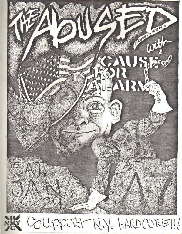
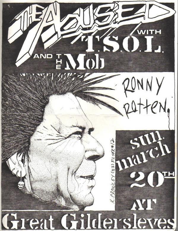
RONNY ROTTEN
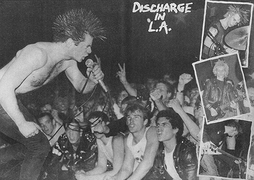
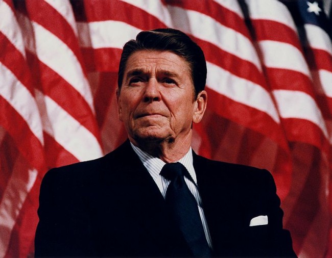
Discharge from files.nyu.edu, Ronald Reagan in 1982 from commons.wikimedia.org
For the last character that Crowley ever introduced, he again followed the question “what would happen if?.” This is when he invented one of his favorite characters: Ronny Rotten. “I thought, wouldn’t it be cool if Ronald Reagan had a secret alter ego as a punk rocker,” explains Crowley. He drew Reagan’s profile, added three earrings and a mohawk “in Discharge fashion.” He adds: “The fact that I could play his name off of Johnny Rotten (a true punk icon) was the icing on the cake.”
Leave a Reply