Crass equals Gee Vaucher as Black Flag does Pettibon. Vaucher is the one responsible for Crass’s artwork. Rather punk than hardcore but thrilling enough to be no.3 in my follow-up series on classic hardcore layout.
Gee Vaucher (b. 1947) did the artwork for British punk band Crass from 1977-1984 mostly out of Exit Stencil Press which she founded with her college friend, on and off lover and Crass member Penny Rimbaud.
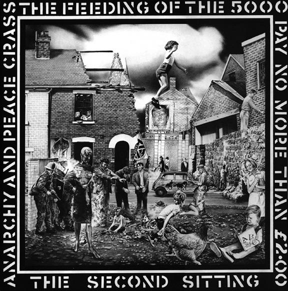
Vaucher used a lot of collage for her artwork for Crass or her fanzine “International Anthem. A Nihilist Newspaper for the living”, which she put out during the same time. For her, collages have a special draw to viewers which makes it hard to pull back. That was a way to confront them with her political messages on feminism, pacifism and anarchy sometimes expressed through a rotting corpse mixed with other elements. At times these collages were carefully planned, other times she would throw bits of paper around and go with how they would settle one on top of each other. These collages have a clear pop art influence, which dates back to her art school days beginning to mid 1960s – easily seen in comparison to Richard Hamilton’s “Just what is it that makes todays dream homes so different, so appealing”(1956). A lot of her works were as-if collages, though, and makes them the more stunning. What appears to be a collage was painted with a tiny brush and a solitary tube of black gouache. She just diluted the color according to a brighter or darker effect – like the cover above of “The Feeding of the 5,000”. Today, she says in an interview with Eddie Thomas, her eyesight doesn’t allow this kind of drawings anymore.
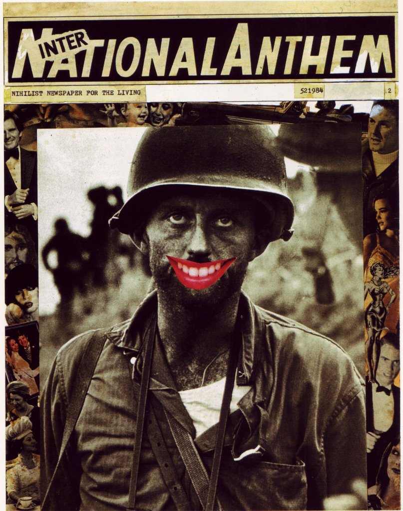
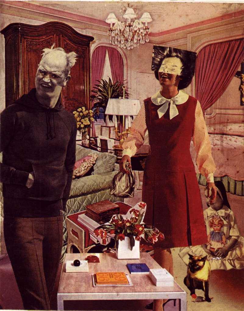
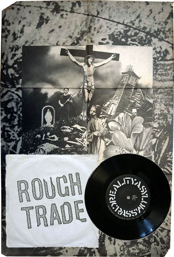
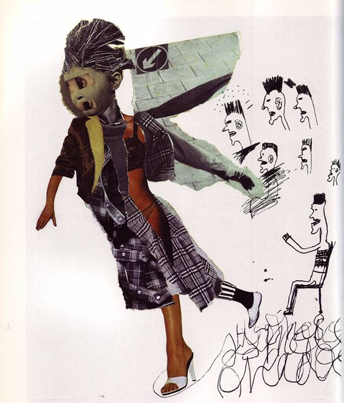
[1] Cover of “The Feeding of the 5,000” from crassahistory.wordpress.com; [2,3] Collages for International Anthem Number 2 “Domestic Violence”, 1979; [4] Japanese single “Reality Asylum” with foldout poster on Rough Trade Japan (1981); [5] Collage for “Honey Bane you can be you”, Crass Records 521985/1; all from crassahistory.wordpress.com
A special feature of the Crass releases were foldout posters which accompanied the records and featured Vaucher’s artwork like the one above (3). “The Feeding of the 5000” LP was for example only folded in its poster. Penny Rimbaud traces the use of these posters back to the sixties’ broadsheets, which he says Crass were the first to apply for records.
Exit Stencil Press was revitalized in 2008 and Gee Vaucher still lives and works as an artist and does works like the one underneath. “Art’s always what I’ve done – I can’t remember not doing it”, she told the author of “The Story of Crass”, George Berger, accordingly.
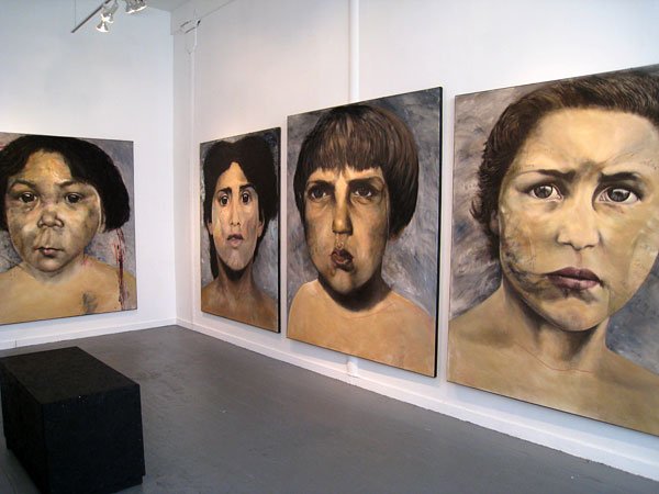
Image from streetbonersandtvcarnage
Two other elements contributed to Crass’s distinct artwork: the stenciled logo and their use of typeface.
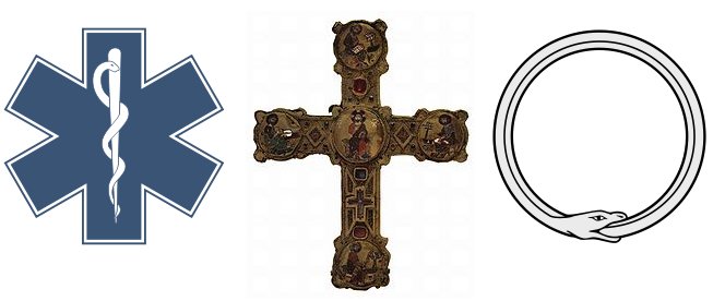
“We were one of the first outside the big boys like Ford, to use a corporate logo so effectively”, notes Penny Rimbaud in “The Story of Crass”. The logo was originally designed by Dave King, a college friend of Rimbaud and Vaucher, for Rimbaud’s book “Christ’s Reality Asylum” and was meant to incorporate the main institutions the book tackles – family, state and church.
![]()
![]()
Images: from (1) crassahistory.wordpress.com (2) Crass logo from stencilpunks.org, (3) First stencil of Crass logo on “Christ’s Reality Asylum” from Goteblüd
There are some “archetypical” symbols which where mixed up here as King explains in an interview: the Greek star of life, the christian cross, an ouroboros, which is a symbol of a serpent (or dragon) eating its own tail, the Union Jack, and Japanese family crests – a majority of the latter designed in a circle or square. In another, more recent interview Dave King especially highlights these crests and celtic crosses as main influences. He explains how he played in the ruins of the Second World War as a child that had as a background celtic crosses that “were around” and he especially remembers one of these crosses that ended up in the center of a roundabout with only the cross and the circle around it to see – the “first graphic thing” that he noticed in his life. Apart from the influences highlighted by Dave King, someone else also highlights the similarity of the logo with the one of the Captain Scarlett logo, a 1960s British television science fiction series.
King also explains how the logo was “fashioned in that no part would touch another part so that you can make it into a stencil.” All 50 copies of “Christ’s Reality Asylum” – individually sprayed – were thus the first outputs that sported what would later become the logo of Crass.
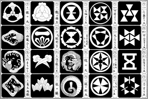
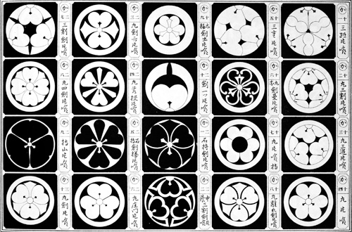
Images: from (1) (2) (3), (4)(5) Japanese family crests from riddip.com,(6)(7) Drawings by Robert Clark aka Robert Indiana from art.findartinfo.com
Crass were the first to pick up stencils in punk. With no money at hand, stenciling was the way for easy reproduction. At that time stencils were already done by artist Robert Indiana aka Robert Clark and served Crass as source of inspiration. “Fight war not wars” or “Stuff your sexist shit” were the messages they put up throughout Central London since early 1977. The album title “Stations of the Crass” was chosen to celebrate their spray can art as the one at Bond Street Station of London Underground which figures on its cover photo.
Crass Stencil at CBGB. Image from killyourpetpuppy.co.uk
The other graphic element was a mix of typewriter font, where dashes would substitute punctation combined with a stencil typeface. Latter was made available for the digital age by Faizal Reza and can be downloaded at dafont or fonts4free.
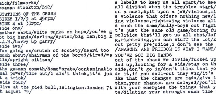
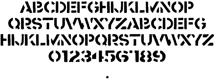
Images: (1) Part from the booklet of “The Feeding of the 5000” (2) crass font by Faizal Reza from fontspace.com
The larger context of the artwork of Crass was sure enough other punk fanzines, pamphlets and flyers. Below are some which were given to Crass between 1977 and 1984. They were exhibited in October 2011 at boo-hooray along with works of Gee Vaucher. It’s a selection of an archive of around 3000, which was safeguarded by her.
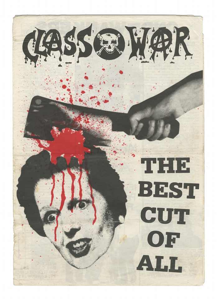
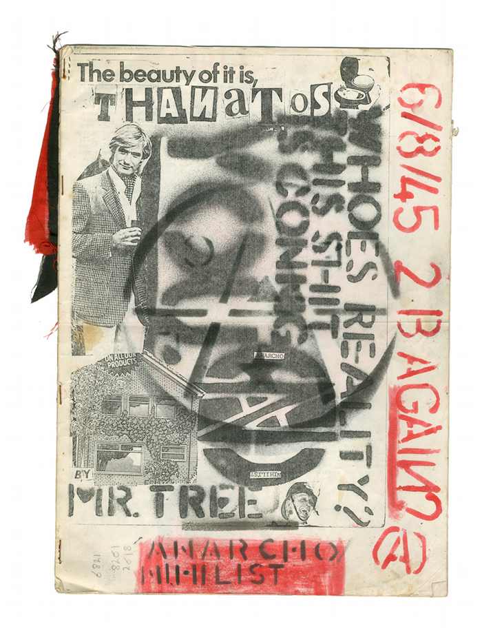
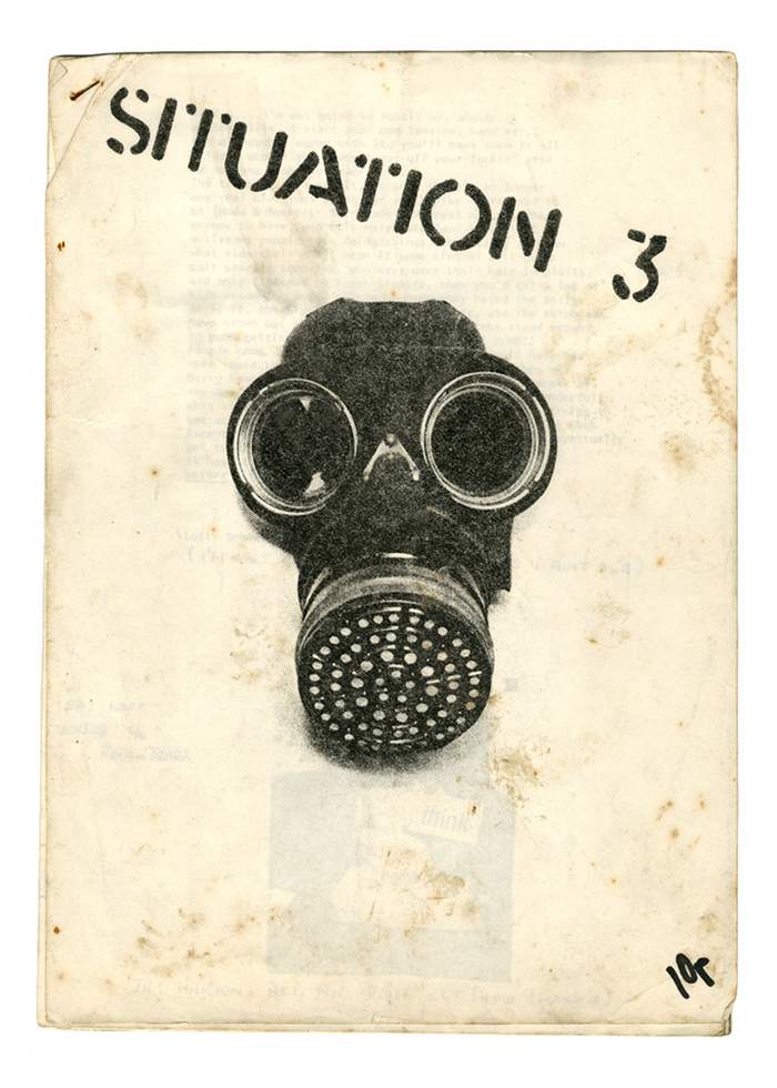
Images from boo-hooray.com
More
/ A guide to Crass Records – great site, great source.
/ Crass and stencil : urbanario.es or sterneck.net
/ Interview with Gee Vaucher about her work for Crass by Eddie Thomas at subba-cultcha
/ Interview with Gee Vaucher at Vice
/ “Crass Art And Other Post-Modern Monsters” by Gee Vaucher
/ “The Story of Crass” by George Berger
/ Video on the art of Dave King and Gee Vaucher on MOCAtv channel on youtube (12min)
This post is part of series on hardcore(-punk) layout. The complete series so far can be found here.
Leave a Reply