Images: The Abused cover from vinylnoize.com; show flyers from myspace.com/theabusednyc/photos
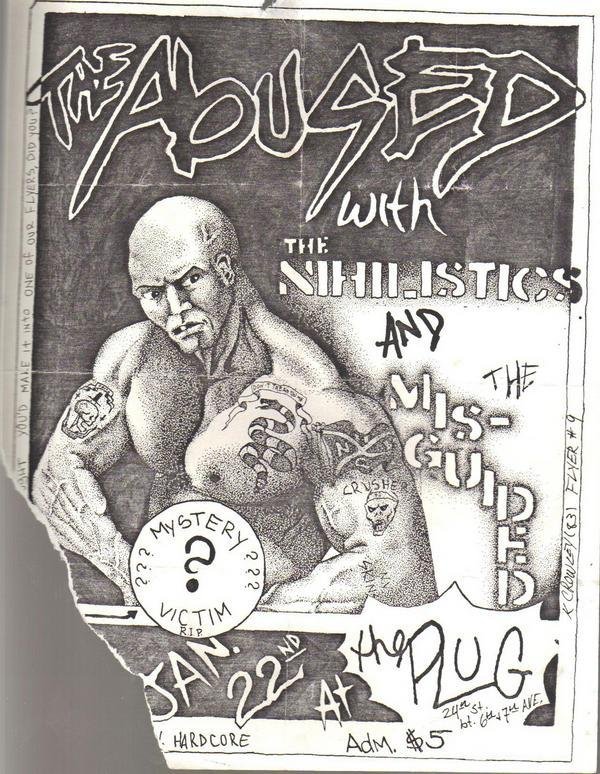
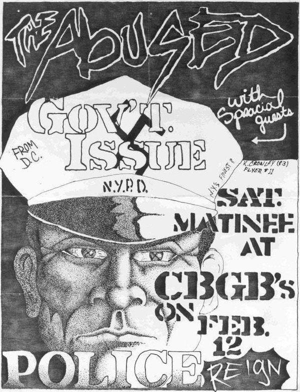
Kevin Crowley, singer and drawer of The Abused, is a reference for quite a number of people when it comes to design in hardcore. His work spans over the brief period of 10 months during which he did the art work for The Abused’s one and only EP “Loud and Clear” (1983) and the flyers for the twelve shows they played in 1982-83. Apart from that, he is the creator of the now famous NYHC logo that figures in the inlet of their LP for the first time. Reasons enough to make him no. 6 of my series on hardcore(-punk) layout.
His artwork distinguishes itself the most from other hardcore art works by its pointillism technique. This technique was “really labor intensive”, as he told Gordo from Doublecross, “and the flyers took a long time to complete.” But also his screaming, angry, bold-headed, muscled men should set standards for band covers to come (I’m thinking here of Unity’s “You Are One” or Ten Yard Fight’s Demo) and took certainly part in making the tough guy hardcore’s dominant masculinity.
The most glaring inspiration from these elements is Spoiler’s cover for Justice’s “Loud and Clear” – he himself even speaks of a rip-off of Crowley’s work. But also the singer of Life As War for example used the pointillism technique for one of their LPs.
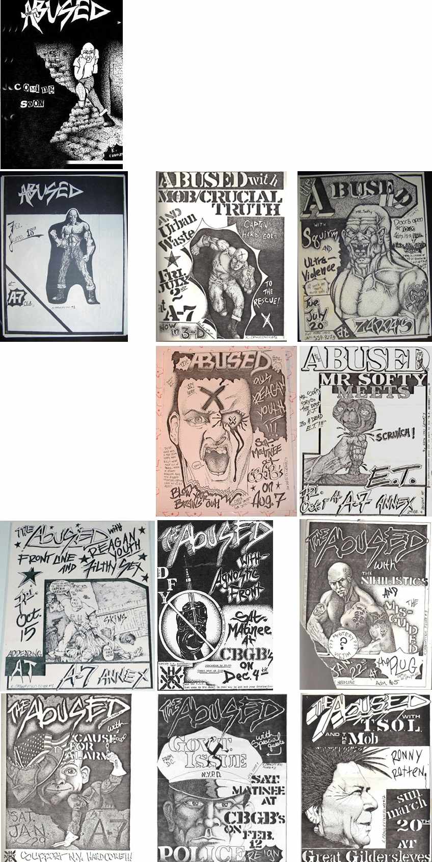
Images from myspace.com/theabusednyc/photos
These are the 12 show flyers Crowley drew for his band from June 1982 to March 1983 (impossible to find no. 4 online and no.7 got actually never distributed to the public). He did one other flyer announcing the bands’ “coming soon” to create some hype around the band. Interestingly, Crowley numbered, dated and signed each flyer in rather prominent places. Sometimes he also put in personal messages like “(…) thought you’d make it into one of our flyers, did you?”. Apparently, the band members (mainly their bassist Raf Astor) also did graffiti on the inside of some of the covers of their vinyl.
Another common feature of the flyers according to Cooch from Vinylnoize is that all of the flyers were made on the same machine by one of the band members who worked in an office with a copier.
Putting all the flyers in their chronological order next to each other also shows the evolvement and the changes in the logo from changing the letter “B” to lower case to adding the shadow how it also appeared on their LP.
Concerning the NYHC logo that Crowley created, it is rather interesting to see that the lines later on got substituted by straight lines and the letters also don’t overlap with the lines in later interpretations. Here the original:

Images from myspace.com/theabusednyc/photos
Crowley didn’t pursue arts in any ways. In 2009 he states in an interview “I’m pretty settled. I’m married and have kids. I currently work in finance (although I’m not 100% certain what I want to be when I grow up).”
Leave a Reply