Author: Marion HFsPage 15 of 16
“What the fuck about them is street?”, asks REVOK in this interview about brands who use people from subcultures to ‘streeten up’ their image and designs. The interview…
Which kind of typography influenced this book cover above? The answer will bring you back in time to the visual branding of the Black Panther Party. Actually, there…
Screenshot and image from http://playge.net
I guess this is still the aftermath of christmas but if there would be a bakery offering these kind of treats with sub/pop-cultural influences and only these, I’d…
After necklaces and plastic toys, here comes another tack on using a fatcap as a starting point for design. This time a more convincing one: Chairs in the…
I don’t care if dices were just a fad or are still cool. This packaging by Meiji of their dice caramel (which can really be used as dices)…
I love sneak peeks and some of the best sneak peeks are those into work spaces. Here is one of artist 108 (Milano), working for Obey, done by…
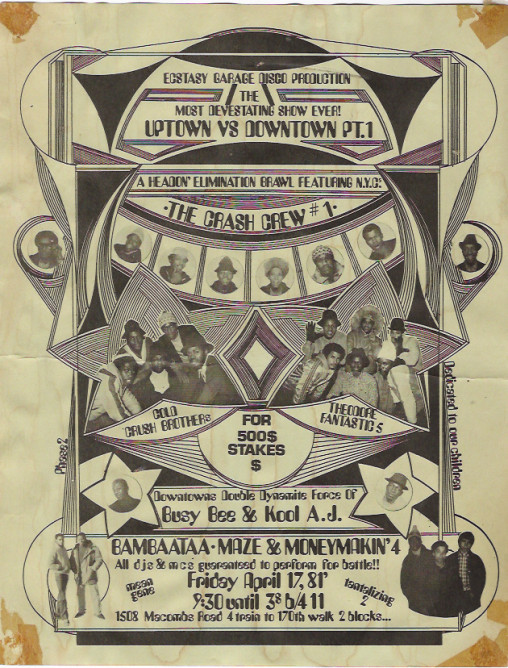
Back in the days, flyers were the thing to do to get the word out about jams and battles, or how Troy L Smith says: “They were the…
Photos of broken deck: RotorPhoto Monster Dice: Nieves Publications Lately these three objects above have grasped my attention. The wooden wild cat which was given to me as…
Photos: projectprojects.com X-ing up with a thick black marker, triple Xs or a single X on record sleeves, skin, buttons, flyers or clothes in all different forms thinkable…that’s…
It’s been quite a while since I’ve seen photos which actually told me a story of people and places I don’t know. In fact, I read this post…
Another skate related project but this time from Tokyo based photographer Shama. Above the promo flicks from his exhibition “frame cruise” in Kyoto. I somehow like the juxtaposition…
I wasn’t sure if I should post these spoons because I basically still don’t know what to think about the skull as a symbol even if I think…
How can pop culture, DIY, recuperation and health food go together? The project “MANGA Farming” by Japanese artist Koshi Kawachi from 2009 gives us a hint. Bottom line…
These photos from the series “The Bastard Chairs of China” by Michael Wolf and published as a book “Sitting in China” in 2002 brings us to the backyards…
Hangul – the Korean alphabet. Apart from the very simple, bold and geometrical basics of all its letters, I’m just amazed by how it can be used to…
Recently I was thinking about the idea behind the cups I bought at a pretty much hidden parallel street to the classic and now very touristic pottery lane…
Images 1-3 from merchnow.com / 4 harshforms Regardless of the flood of typography books in recent years, I still think that best ideas for typography are to be…