Category: Thinking Design Differently

Counter standardized seating: mechair by Lee Sanghyeok

It’s in the name: MeChair – me, myself and I. You could also call this chair the epitome of an individualistic, capitalist society. MeChair is a chair that…

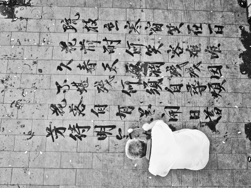
Dishu. Art for the art’s sake

Photos (2)&(3) from francoischastanet.com, (1,4) from dokument.org A bucket of water, a brush and pavement. These three things make up dishu or “writing calligraphy on the ground”. Art…

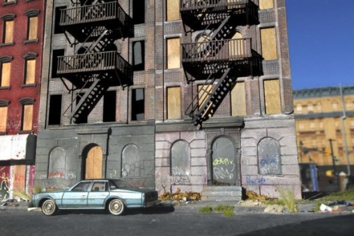
Doors of creation Or: the imagined ghetto

It always fascinates me how many pre- and misconceptions people carry around with themselves. All of these conceptions influence perceptions, the interacting with things and people and the…

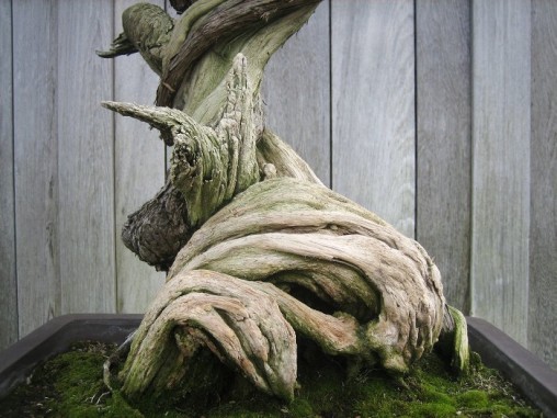
Bonsai at Huntington Library

The full beauty of Bonsai probably only comes out when seeing them wholly. But the stems of these Bonsai at the Huntington Library are just amazing.

Reader boards and the question of inspirational flows

Marquees, signposts of cheap motels or gambling halls, gas-station enamel signs, police badges, naive logos or cheap playbills are all examples of visual references and inspirations used by…

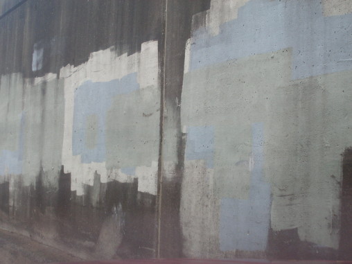
Graffiti removal

Grey or other colored rectangles are the answer to graffiti in most North American cities, giving rise to some interesting new patterns of wall-painting.Matt McCormich made a film…

thinking design differently: seats out of rice straw

Photos:(1) Modern adaption of Shimanawa created with rice straw wattles for Little Tokyo Design Week LA 2011 photographed by Redteam, (2) Shimanawa at Izumo Taisha shintō shrine by Takashi…

Thinking design through slashes

maybe. Images: [1,4] raw.marz-chew.fr, [2] jsbj.tumblr.com out of book “Ma ligne” de Fuzi; [3] mns1.canal-plus.net; [5]: “Concept Spatiale”, painting by Lucio Fontana from en.wikipedia.org

bonsai & the two thirds rule

I went to a bonsai exhibition a while ago where I saw the one above. This is asymmetry in 3D at its best. Asymmetry translates into the rule…

bring handwriting back

Images top to bottom: sneakernews.com / courtesy of seedsofenchantment.wordpress.com / blog.goo.ne.jp/be-guru0713 / belgium44.exblog.jp Real handwriting done with a real pen. A perfect choice to make your packaging really…

how ikebana can teach a lessons about asymmetry

Image by: zen-images.blogspot.com Want to learn more about asymmetry and in all three dimesions? Take Ikebana lessons!Ikebana is basically arranging cut stems, leaves, and flowers in vases with…

revok asks “what about them is street?”

“What the fuck about them is street?”, asks REVOK in this interview about brands who use people from subcultures to ‘streeten up’ their image and designs. The interview…

back to basics: a folk technique revisited – from wood burning to laser-etching

Photos of broken deck: RotorPhoto Monster Dice: Nieves Publications Lately these three objects above have grasped my attention. The wooden wild cat which was given to me as…

comics as sprouting jars. pop-culturalize your kitchen

How can pop culture, DIY, recuperation and health food go together? The project “MANGA Farming” by Japanese artist Koshi Kawachi from 2009 gives us a hint.  Bottom line…

integrate wearout into design

Recently I was thinking about the idea behind the cups I bought at a pretty much hidden parallel street to the classic and now very touristic pottery lane…

tomobako – take wrapping to another level or from the margins to the centre

the abode of the unsymmetrical