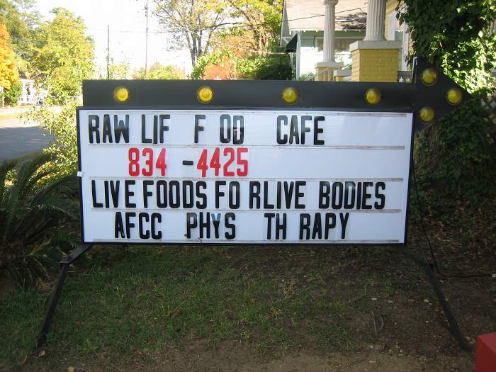
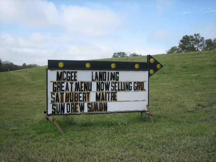
Marquees, signposts of cheap motels or gambling halls, gas-station enamel signs, police badges, naive logos or cheap playbills are all examples of visual references and inspirations used by designers since quite a while.
According to a chapter of 100 Ideas That Changed Graphic Design published on Creative Review (CR), this started with architect Robert Venturi. Venturi was the first to take this “forgotten symbolism” seriously for his work and the one of his students. Together with Scott Brown and Steven Izenour he took them on a trip to Las Vegas in 1968, that followed the now classic book “Learning from Las Vegas”. House Industries who inspired themselves from hardcore flyers to create fonts are mentioned in CR as a contemporary example as well as the works of Florian Lamm, Vincent Perrottet, Charles S. Anderson or design duo Randoald Sabbe and Jan W. Heespel.
All this could easily sound as if the inspiration is always and only one-directional from laymen to designer. When looking at North American reader boards it is however easy to see how much typographic principles of for example left, right, center or full justification are already common sense or belong into the realm of “mainstream typography”. Here, it is probably rather the exceptions that can – in turn – become inspirations for designers.
Leave a Reply