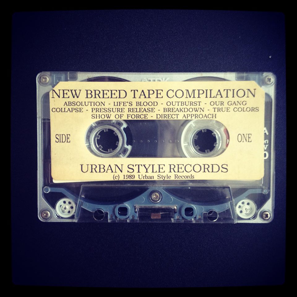
700 copies, 35 songs from 20 bands and a 20 page booklet: The New Breed compilation cassette tape, released by Freddy Alva and Chaka Malik on Urban Style Records in 1989, doesn’t need much introduction. It incarnates the epitome of 1980s hardcore tapes and belongs for some to “the holy trinity of NYHC comps” next to the “The Way It Is” cassette compilation put out by Revelation Records in 1988 and the “Where the The Wild Things Are” tape put out by Bill Wilson on Blackout Records in 1989. Its notoriety remained striving so much so that Alva re-released the cassette as an LP edition in 2011 on Wardance Records, Alva’s later label, followed by a documentary film in 2016. The fundamental importance of New Breed is probably its gateway position to what came to be known as the “new school” of hardcore in the 1990s; a “new generation of bands” as Brian DeMoa puts it as a lot of people from bands on New Breed moved on to found some of new school’s foundational bands such as Quicksand, Born Against or Burn.
Looking back, New Breed was also in many ways the last of its breed. For one, the medium cassette tape was already a dying breed by the time New Breed came out. An era where putting out a tape as a band was a big deal came to a closure at the end of the 1980s. Also, two third of the bands on the comp had broken up by the time New Breed finally saw its light. But maybe much more so, the New Breed cassette compilation stands for drastic changes in the New York hardcore scene at the end of the 1980s. “[A] lot of knives came out,” as Duane Rossingnol tells Tony Rettman in NYHC (2015:303), swinging hammers could be seen at CBGB’s and the general peek in violence made that shows were more and more often shut down. Also, CBGB stopped doing matinees in the middle of 1989. Some Records, an epicenter for NYHC bands to meet, form and sell their demo tapes —substituting in some ways for the record label missing in New York at the time—, also closed its doors just a few months before New Breed came out. Eventually, the infrastructure that had characterized NYHC from the mid-1980s on slowly fell apart and saw its centre shift to ABC No Rio at the end of 1989. These shifts in NYHC’s centers were also mirrored in the splintering of a scene that was formerly driven by a unity credo. Bills now catered to specific sub-styles of hardcore (featuring for example all straight edge or all tough guy bands). A part of the scene also started to distance itself from tough guy behavior and “a gang-like mentality” and adhered to a PC, non-violence stance as Alva explains Rettman (2015:337), which however only supported the scene’s splintering. Some people also felt that hardcore in New York as a genre became more streamlined by the end of the 1980s and lost its previous musical variety as experimentation gave way to formulas.
In short, New Breed is iconic in many ways. It is also a hardcore outlet that is anchored in an enormous web of hardcore references. When talking to Freddy about it, he thus recurrently used words like “influence”, “tribute” or “copy”, all referring to a sort of hardcore genealogy. But the idea of setting oneself apart from previous hardcore releases was equally present in Freddy’s formulations. Continuity and rupture is thus how New Breed’s graphic design is probably best described. But more so, looking at New Breed’s layout is an entryway to understand end-1980s New York hardcore kids, their socio-economic backgrounds, subcultural developments of hardcore and graffiti in New York City in general, imagery traditions in hardcore as well as hardcore kids’ comic love and DIY workings. As a ’90s hardcore kid I dove into a world of hardcore of which I only know bits and pieces and I can only thank Freddy for walking back the memory line with me and patiently answering to all my questions.
CONTINUITY
Continuity and in such a sort of recognition value was one of the main driving forces behind the New Breed’s compilation tape lay-out process. For one, Alva wanted to keep a continuity with the same-titled fanzine that he had published before: “Having done one issue of New Breed fanzine previously, the look for the compilation was geared along the same lines: Graffiti, show flyers, live photos.” But Alva pushed the consistency even further than this by working always with the same “photo model” that was Djinji Brown: “I designed the layout for the booklet with Djinji Brown from Absolution on the cover as well as various ads that featured Djinji in different poses, all done to maintain a consistency in style.”


[1] Fanzine advertisement 1989; [2] –?– ; [3] Advertisement for MRR May 1989; all images from facebook.com
The font choice was equally crucial to be and stay recognizable. Apart from the essential typewriter font, two main fonts were used: Princetown Regular and Stafford Bold. Freddy explains about Princetown Regular that it “was popular among Straight Edge releases and while we weren’t straight edge, we appreciated the collegiate look to everything that font lent itself to.” And he explains his choice for Stafford Bold in some more length:

[1] myfonts.com; [2] –?– ; [3] worthpoint.com
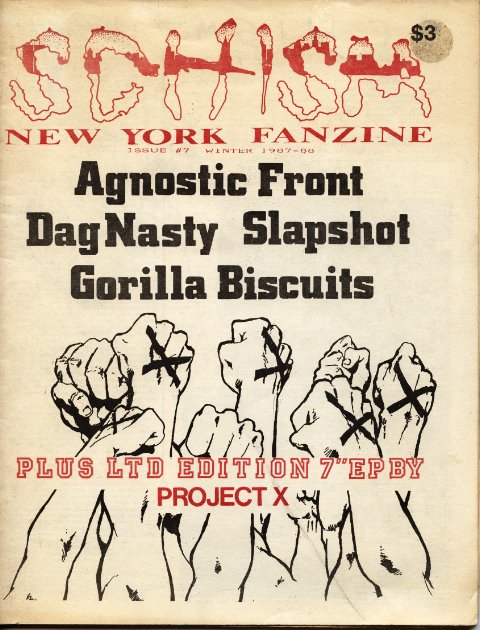
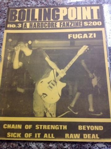
“I think it was fanzines like Boiling Point and Schism that started those clean cut fonts and I soon learned that they were influenced by classic Boston designs like SSD’s 1st record cover. Both of these sources inspired the clean look to the compilation and booklet. I thought it suited the music in the sense that it was clear and direct with no fancy overtones, it spoke to us and year after the fact; I believe the font is called Stafford Bold. Unless someone can prove that it goes by another name; I’m going to stick with this particular name. In 2016 when I worked on the New Breed Documentary; I made it a point to use the same font and as I work on my upcoming Urban Styles book, once again I’ll utilize this font. I love it and I guess it’s now a part of my identity.”
![]()
wikimedia.org
Another clear influence for the choice of both fonts came also from Alva’s and Chaka’s hip-hop background and the clean cut fonts used there – especially Run DMC’s and EPMD’s logo:
“I would say the font used on the classicRun DMC logo, with the solid bar on top and below, was a big influence. The logo had a neat, clean and visually direct look to it. That set tone for the way I wanted our comp to look, as far as the type of font that would be used predominantly throughout the tape layout and lyrics booklet. The rap group EPMD also had a similar look to their logo; me and Chaka both came from a Hip-hop background so maybe unconsciously what was going on in Rap records layouts circa 1986-1988, really influenced us.”
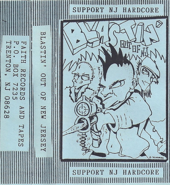
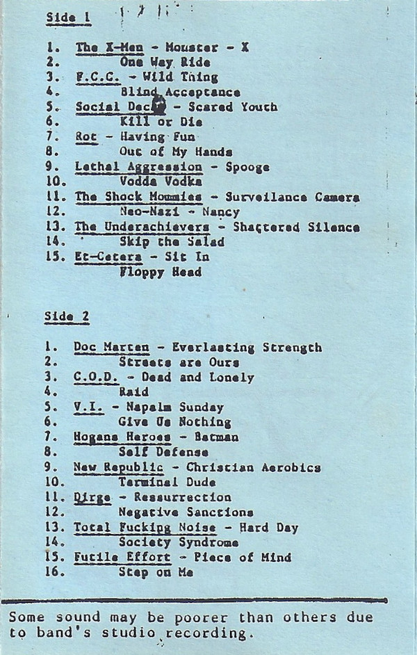
But Alva and Malik not only looked for continuity concerning the New Breed brand itself but did also put New Breed layout-wise into a genealogy of New York hardcore compilation tapes. History made it so that New Breed can be understood as standing graphic-wise at the end of this genealogy. Three tape compilations were main influences for the New Breed compilation tape: Guillotine Fanzine’s cassette compilation “United Scene” (1985) as an inspiration to make the tape, “Blasting Out Of NJ” (1986) as an inspiration for the layout of the tape and “Charred Remains” (1983) as an inspiration for the booklet and its size.
“The Guillotine compilation and by extension, Guillotine fanzine, influenced me as far as it being a NY entity that was covering local bands. The compilation they put out was meant to give newer bands exposure. The pioneering A7 scene circa 1982-83 had already been well documented as a lot of the bands from that era had put some kind of recording out. The second wave of bands was starting up around 1985 so this comp was a crucial gateway into what were (back then) the new blood. The publisher of Guillotine, Wendy Eager, happened to be living in my neighborhood of Jackson Heights when I got into HC so seeing somebody local do something so scene related was a big inspiration. I took her concept of compiling newer bands that she was, for the most part, friends with. I also copied using both demo and live tracks on the New Breed comp. The Guillotine comp was probably the first or second tape compilation I ever bought so it forever laid the blueprint for me on how to do a regional sampler. Fun fact: Anthony Communale is the only person that plays on both comps: with Token Entry in the Guillotine comp and with Raw Deal on the New Breed.”

[1-2] discogs.com; [3] facebook.com
“The cassette layout is directly influenced by the ’86 ‘Blasting Out Of NJ” comp tape,” Freddy tells me and adds: “I picked this comp tape up at Some Records in ’87 and copied the design layout on the tape insert for the New Breed tape layout. ‘Blasting Out Of NJ’ was put out by Jonathan Levine of Faith fanzine in 1986. The tape featured Doc Marten, The X-Men, FCC, Rot and about a dozen other wonderful but now forgotten NJ bands. He also released the Crucial Youth ‘Straight ‘n Loud’ 7″ on his Faith Records in 1987.”

[1] quixoticdreamsnyc.blogspot.com; [2] facebook.com; [3] Screenshot New Breed Documentary
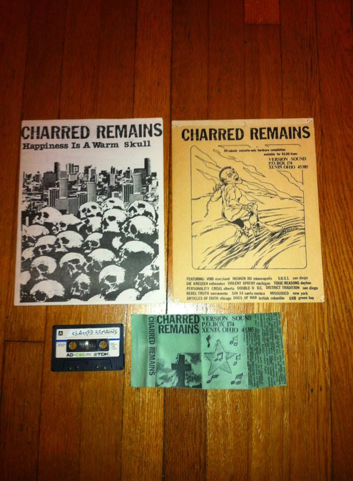
As much as “Blasting Out Of NJ” served as an inspiration for the tape layout, the inspiration for the size of the booklet “came directly from older tape compilations like the ‘Charred Remains’ comp from ’83 that also featured a full size 8’X11′ booklet.” “I remember picking this [the Charred Remains compilation] up in ’86”, Freddy wrote once, and further “I later copied the full page/band booklet layout for a comp tape that I did in the late 80’s.” It was just a nice coincidence that the size was exactly one of comic bags: “Our background in collecting comic books came in handy as we immediately saw that the tape and booklet fit into a standard comic book bag,” as Freddy explains me and adds further:
“I collected the standard Marvel comics like The X-men, which was a favorite. I also dug Daredevil, Ghost Rider, Spider Man & The Avengers. I only collected for a couple of years and never obsessively like some of my friends. I probably got out of it by the time I was 14-15 years old. I will say that the way one protected the comics via clear bags transferred on to when we made compilation and stuffed the tape and booklet onto a similar comic book bag. Said booklet also had a huge comic book vibe to it; what with the different cartoonish graphics and all. Comic book aesthetics have definitely subconsciously infiltrated a lot of the projects I’ve worked and or currently working on.”
RUPTURE: SOCIO-ECONOMIC BACKGROUND, ETHNIC BELONGING AND THE CITY
Parallel to the quest for continuity, New Breed was also meant to stand its (recognizable) ground amidst all other hardcore outlets. New Breed was thus also meant to stand apart and that especially in making a point in case on the socio-cultural background of New Breeds’ authors and bands and hardcore kids in New York in general.
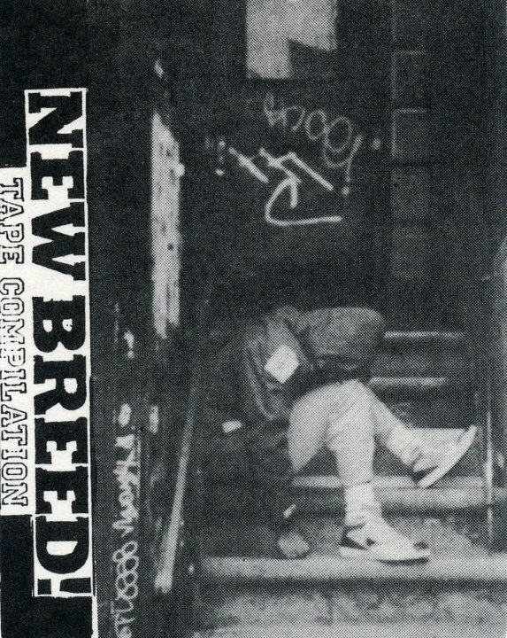
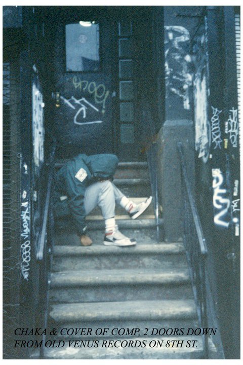
The main means to affirm their standpoint was through the backdrop of the cover photo. Even if New Breed pays tribute to Minor Threat’s Filler in using the somebody-sitting-on-stairs-with-head-bowed-down theme, it is also meant to contrast with suburbia that Minor Threat and DC hardcore in general stood for. The tagged staircase on the New Breed cover —a few doors from the old Venus Records on Eighth Street “on the old shoe stores block”— clearly belongs to an urban, inner city house and not to a suburban mansion as those on Minor Threat’s Salad Days. In such, Freddy also talks about the New Breed cover as an “urban tribute” or “urban homage” to DC hardcore: “I took the picture of the tape cover, the one of Chaka sitting on the steps. This was meant to be our urban tribute to the iconic Minor Threat 7″ cover that features a bald Alec Mackaye with head bowed, sitting down.” “Yes,” he tells me later, “the image of Alec McKaye is from suburbia but you can’t really tell from the picture, we were more referencing the iconic Minor Threat record cover where they are clearly sitting in front of a suburban home. I took the picture of Chaka and we picked on purpose a more gritty, graffiti filled backdrop, all the better for contrasting the differences between our different backgrounds.” The backdrop of the image was, more fundamentally, specifically chosen to point to the differences in socio-economic status and ethnic belonging between hardcore kids in New York and DC. “This was not a compilation made by and for middle-class white suburban teenagers; it was an expression of the lives and experiences and surroundings of young people from all of NYC’s boroughs, of many different socioeconomic backgrounds, ethnic groups, and viewpoints,“ as Brian DeMoa summarizes this in New Breed’s liner notes. Living with parents vs renting one’s own apartments or living in squats, putting out records vs not having money to do so, rehearsing for free in basements vs renting rehearsal rooms, suburbia comfort vs street roughness are thus some of the oppositions that are indirectly present/opened up on the cover.


[1-2] facebook.com; [3] Filler 7″ cover from micsouthkorea.wordpress.com; [4] Original photo of Alec Mackaye on stairs from doublecrossxx.com; [5-6] Photo cover Salad Days from burningflags.com; copyright: Glen Friedman
Another way to demonstrate New Breed’s stance was through Chaka’s clothing style on the cover. Chaka “chose to wear that windbreaker as opposed to his flight jacket because windbreakers were an urban uniform when we were growing up. Everyone from graffiti writers, break dancers, rappers; they all wore windbreakers and we’d seen them growing up in early 1980’s NYC.” He explains further:
“Windbreakers that neatly folded into a hand pouch were all the rage when we were growing up. Breakdancers would wear them to get a smoother traction when performing moves on cardboards. Izod is one of the brands I remember and as they were easy to carry; they were quite popular. You can see early photos of famous Breakdance crews like Rock Steady, Dynamic Breakers and other legendary ensembles. I guess another purpose it served if you were a graffiti writer: there was a big pocket in the front of the jacket where one could easily fit markers/mini black books. These items would stay securely tucked away but readily accessible should the need arise.”
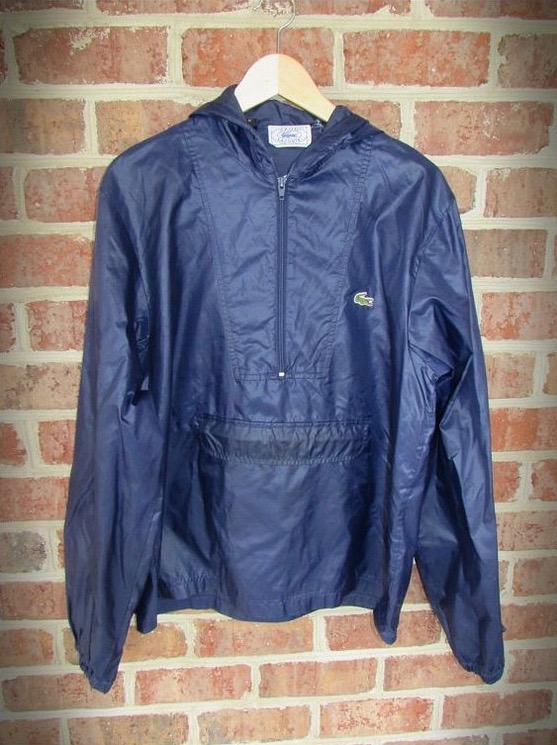
Izod Lacoste windbreaker from pinterest.com
It is thus also not a total coincidence that a Shoe 1 tag is also very present on the New Breed cover. On the other hand, especially in contrast to the New Breed fanzine, these references to hip-hop are rather held subtile. This was also a conscious choice as Freddy explains: “The look we were going for came from an urban graffiti background but we didn’t want to be the same as everyone by 1989. By that point there was an explosion of Graffiti in NYHC related imagery, so it was intentional to stand apart.” This choice made New Breed not only stand apart from DC hardcore but also NYHC outlets such as Antidote or the Urban Blight’s “From the Westside to the Eastside” LP that geared their layout explicitly around graffiti and, in general, the explosion of graffiti-based covers and flyers that characterized New York Hardcore from 1987 on. New Breed’s layout, on the contrary, reserved graffiti for the booklet’s inner part. So there is only “some graffiti on the booklet, for example on the inner over page, Chaka did a New Breed piece as well as writing in his graf hand style the Absolution and Collapse pages.”

Images: facebook.com
But Chaka’s clothing style also references —and here we get back to the continuity-trope— a hardcore band and thus puts New Breed, again, into a specific musical lineage. “The way Chaka’s sitting with his fist on the step,” according to Freddy, “is to highlight the patch sewn on to the right side of his jacket sleeve. You can’t really see it because the image is a bit blurry but that’s a Crucifix ‘1984’ patch on his sleeve. We were both huge Crucifix fans and Sothira’s vocal style greatly influenced Chaka’s future musical endeavors.”

Leave a Reply