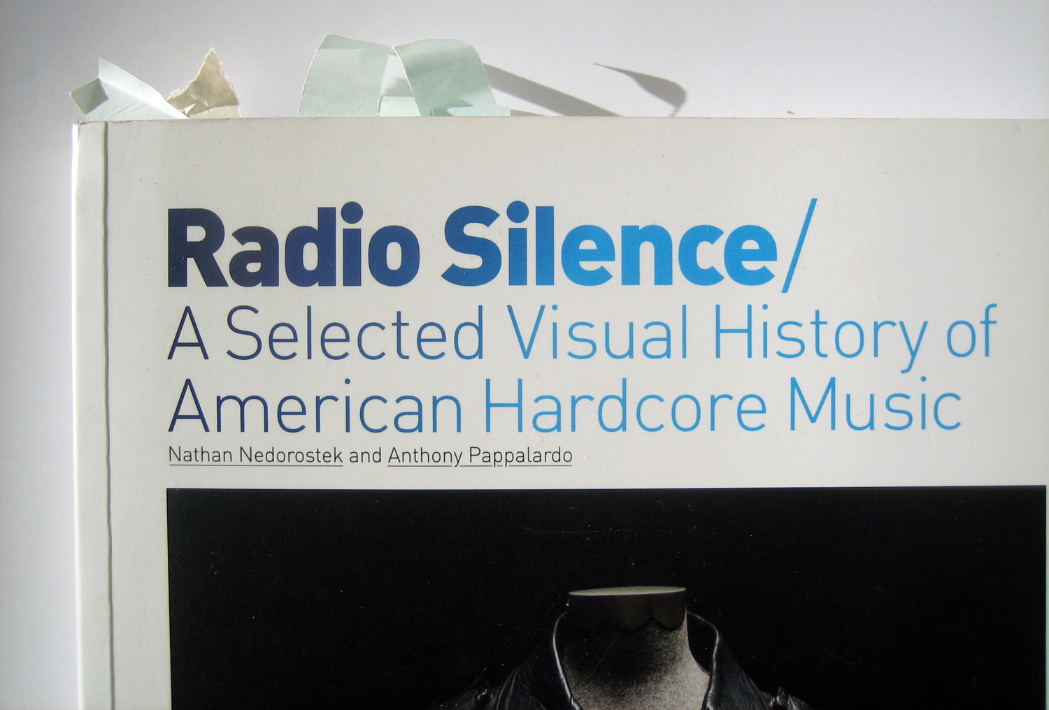
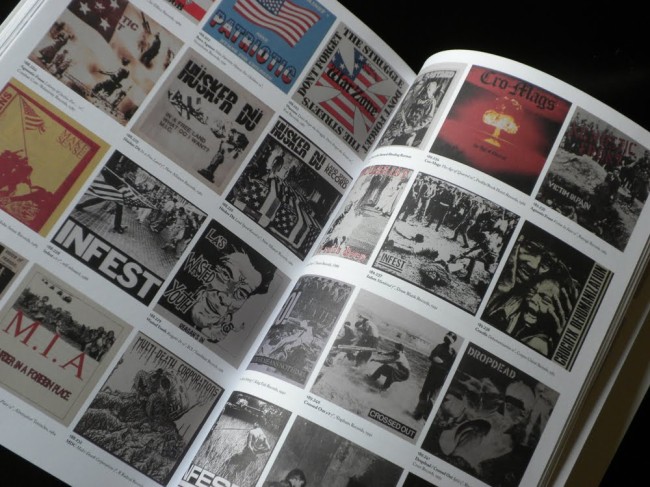
Radio Silence, published by Anthony Pappalardo and Nathan Nedorostek in 2008, is hands down the best book on hardcore. What makes it different from all other texts dealing with hardcore is that it starts with objects to unfold stories on what hardcore was/is. Interview excerpts enhance the story the objects tell. But you’ll never have the feeling that you miss out on important portions of the narration as in a lot of other books. Also, Pappalardo delivers one of the best short histories of hardcore out there in his introductory text. More obviously, Radio Silence served as a huge inspiration for my series on hardcore graphism and a source I always go back to.
It was quite a surprise that none of the authors have been interviewed on the content of the book. “Hell, yeah!,” Anthony answered to my interview request. And I jumped right in.
It’s a quite long exchange we had. I had a blast. There was a lot to think about and learn. Here’s the first part.
—Part [2] is just here.
—Part [3] can be read here.
Harshforms – Let’s start with pre-computer layout in hardcore – the core of Radio Silence. What are the typical characteristics of that for you, i.e. how did that mold hardcore graphism into what it is now?
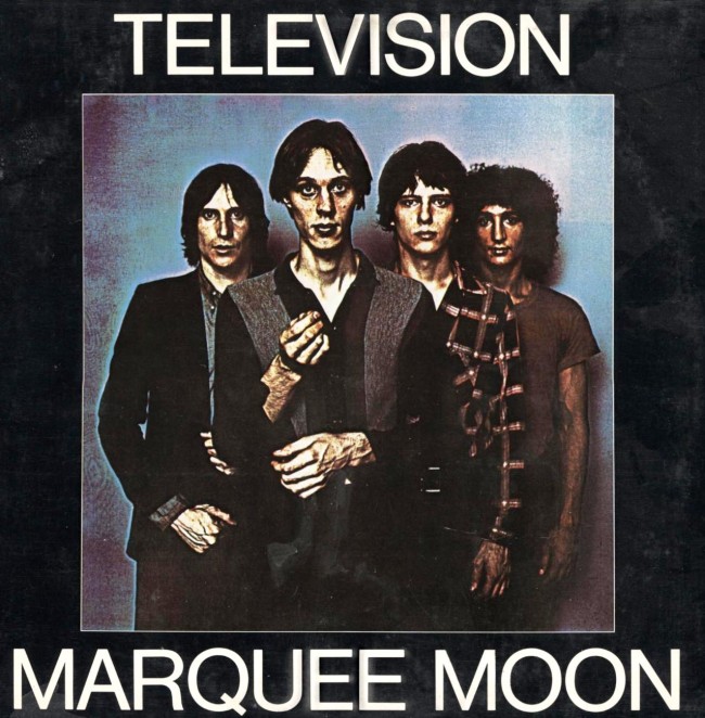
Anthony – Without circling back to every band, label, designer, or style of early punk, I think there is a simple divide you can draw aesthetically: label driven design and DIY design. Whether you’re talking about the Ramones, Television, Stooges, Pistols, or the Clash, there was a label and a designer/photographer involved. Richard Hell might have taken a pair of scissors to his T-Shirts to create the look that informed punk, but he wasn’t cutting and pasting the layout and sleeve for Blank Generation. The early and proto-punk bands had recording contracts and were still operating off the standard record industry model. You had Robert Mapplethorpe shooting the cover for Marquee Moon—actual photographers and designers were involved.
The best example of the opposite of that would be C.R.A.S.S., who formed their own label, did their own sleeve design, and often included those fold out posters that were so fucking cool, but in stark black-and-white. Everything was driven by cost and limitations, but that actually drove the creativity. The typography was stripped down, stenciled, and simple. Appropriated images were collaged, often of raw political atrocities, never sexy photographs of the band against a “cool wall.” And of course you have the UK picture sleeve punk singles that Dangerhouse and later Dischord replicated. But once it all hits the US and hardcore really starts to break off as Punk 2.0, there’s a big change in the aesthetic.
There’s no generalization to make here, because some albums were really complexly designed and others looked like a Neanderthal ripped up some paper and scrawled out some letters in animal blood, but hardcore started to have a look. Part of the charm was that no one really knew what the hell they were doing, kinda. I mean fuck, everyone knows the lineage of this shit by now. You can read essays or watch cute YouTube videos talking about the Black Flag logo , but what it really meant to me was creating a visual identity with what’s around you. And in that process, it was so direct and cool, that it perfectly played against the ‘70s/’80s fantasy shit that was getting boring to me as a kid. Skulls and all that stuff were cool too, I mean, you can’t say Pushead’s art isn’t a huge part of hardcore, but so were the sans-serif fonts—often odd ones that weren’t common, because they were rubbed off a sheet of press-type found in a graphic arts class, laying there since the ‘60s.
If punk sleeve design was the Clash’s reimagining of an Elvis album sleeve or simply pictures of four humans standing somewhere, posing for the camera, hardcore was about misspelled song titles, blurry live photos, images so blown out that you could barely tell what they were, let alone where they were taken, and somehow much more iconic. You can say a photo of Iggy Pop is iconic or Sid Vicious, but to really say something is an icon, you can look no further than hardcore’s most popular logos and how they are as popular as the Nike Swoosh.
goodbadmusic.com
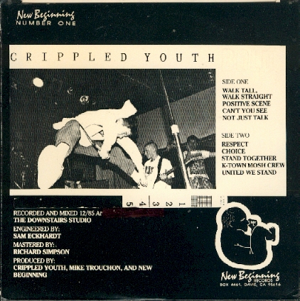
None of this means it was primitive or unskilled, it was just more direct and naive. There’s some great design on hardcore sleeves and flyers, but the way to execute then was so different. Now everything goes from your computer screen, directly to a printer, but back then there were several ways the whole thing could get fucked up. You take a photo, someone else develops it, another dude halftones it so it can be printed, you’re setting type on some paste up, showing another human how to place shit on the printing press, is there any surprise why some of this stuff got fucked up, like Crippled Youth’s 7” having a ruler printed on the sleeve? That’s the charm.
Then everyone got computers and suddenly decided they were great at using Photoshop, and it became flames and shiny type. Gross, but it was a necessity. Now we have every type of design at once, but rarely is actual design being pushed, because there are so many people doing it. It’s harder to do something unique, so instead we have 30 year old men, intentionally trying to draw something that looks like it came out of a 15 year old’s notebook in Yonkers, NY circa 1987. Or you ape whatever genre that came before that you’re into, so people know what to expect. And of course, you can use one of three approved fonts, throw a live photo in the mix and have that cover too.
Everything is just rebooting something else at this point. It’s not a criticism, but something gets lost when you’re intentionally trying to make art look a certain way, instead of your art looking a certain way, because it’s a product of the time.
Harshforms – Nathan and you both also highlight the hand drawn-aspect of pre-computer layout in your book. Maybe you can say more on this as it seems that it was something that really stood out.
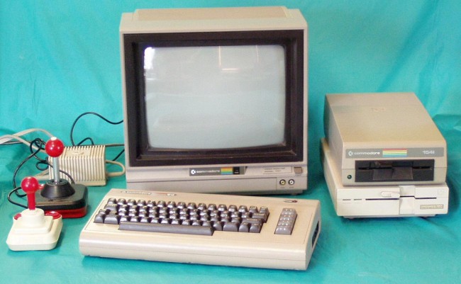
Anthony – I’d be lying if I said I didn’t grow up with computers around me: of course I did. But these were almost useless and cumbersome compared to the worst cell phone you buy in 2014. We are talking a Commodore 64, that took 20 minutes just to turn on and didn’t do much else. Even in college, few kids had a computer capable of designing anything other than something that looked like shit. It was easier to lay things out by hand, instead of relying on technology that wasn’t there yet, but it was important to get the skills so you’d be able to take advantage of tech when it did catch up.
What got me so psyched about the early punk and hardcore records I was buying, was that they looked like they were touched by another kid—that they came from someone like me. Just knowing that I could design something that someone else was going to sell was pretty fucking insane.
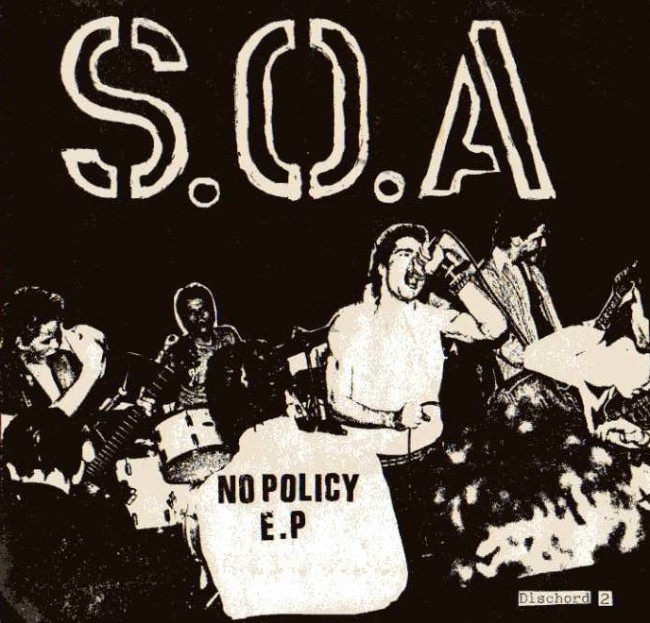
The magic of laying out a fanzine and not really knowing what was going to happen, until you ran it through a photocopier—that’s the best. I could sit there for hours, enlarging and reducing photographs on a copy machine, seeing what happens to the image. Seeing a crystal clear picture of a band is nice and all, but what the hell is going on in the cover of S.O.A.’s No Policy EP? It looks like some surrealist alternate reality, one where some heavy shit is happening. Certainly not the inside of some New Jersey club where a band called Night TriXXX would play to 20 people or some other rock cliché.
The magic of an Iron Maiden album cover is how stylized and professional it looked. It probably took Derek Riggs months to do one. Hardcore records looked equally powerful to me by what they often didn’t show or what they communicated with so little. Whether we’re talking about the first 20 or so Dischord releases, Touch & Go’s early work, Revelation’s early years, or some weirdo hand made shit released on Gravity, I love it all. There are plenty of records that were done solely on a computer that impressed me and continue to have me staring at every inch of the layout, but those design trends that existed in a smaller universe were the ones that I always go back to and trip out on.
Harshforms – Do you have any examples of records done only on a computer that impress(ed) you?
Anthony – Sure, I don’t think computer aided design is bad at all–that’s a broad statement. As with anything new, people went a little crazy with it. When I first got to use a Mac as a senior in high school, I overdosed on all the fonts and tried all these terrible scanning techniques: it was awful.
Jason Farrell is someone who knows how to use a computer as a tool, but not the sole component for his design. He’s always adding in something that has a hand made element or an illustration.
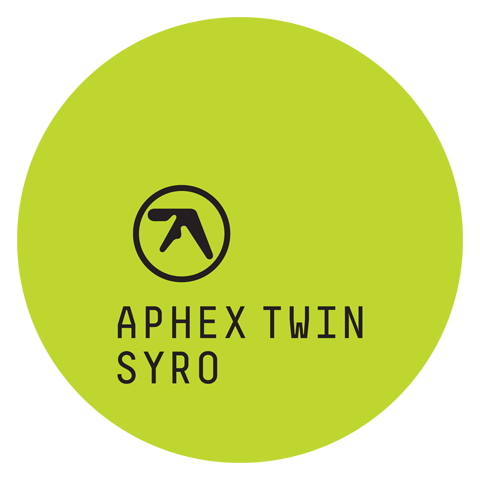
As for an example, I’d cite Aphex Twin’s recent album Syro. Purposely generic with a great concept, but still visually interesting.
Harshforms – So if I understand you right, you are saying that the change to computer-based layout made hardcore layout become
[1] slicker, (too) elaborated and is now made by (near)professionals (i.e. looking at it, it’s hard to think: I could do that, too!) – [or: hardcore became label driven design?]
[2] a one-man-show (instead of an active collectivity) that can rely on a well-functioning production line
[3] an explosion of different styles – loosing its coherence
[4] a mimicry of hardcore layout of the 1980s instead of responding to an actual lived reality and thus forging the visual expression of hardcore in the 2000s?
Anthony – It did many things, from overly manipulated images and type, to blood splatters and paint effects or simply making it easier to use City Bold and a live photo.
It eliminated a lot of the accidents that become so interesting in hardcore design. Instead of a photo becoming ghostly, because it was blown out on a copy machine, the danger was things becoming pixelated and that’s always gross.
There were more people designing sleeves, more albums being released and that means there is more junk. Without limits, things went a little crazy, but it didn’t last too long luckily.
[1] discogs.com, [2] paynomorethan.blogspot.com
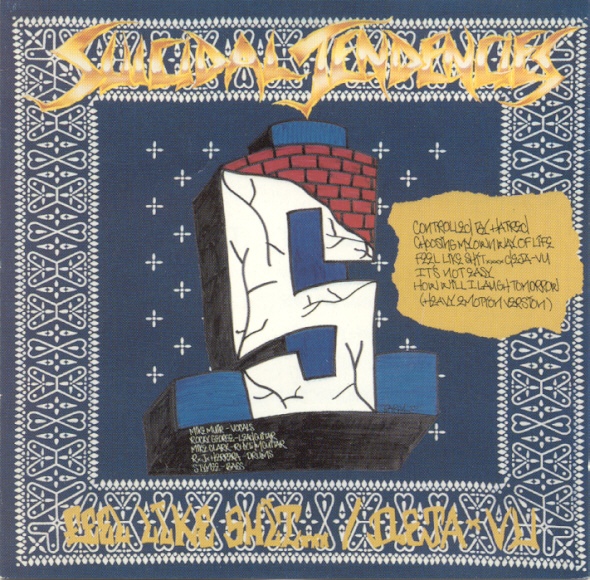
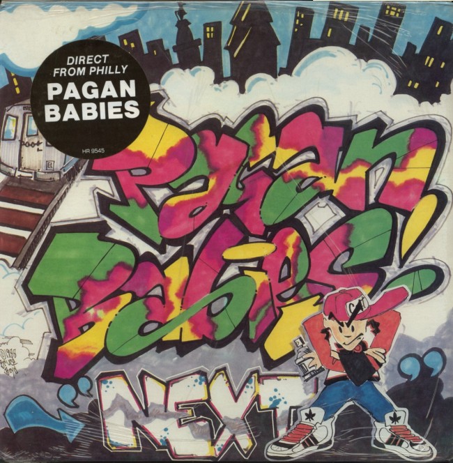
Suicidal Tendencies or Pagan Babies used different types of graffiti as a reflection of what was around them. It was regional expression. So when I talk about mimicking and why it doesn’t resonate with me, it’s because it’s not as genuine: it lacks insight.
When I see a random band from Michigan recreating the style of a band in the New Breed compilation, it’s doesn’t say who they are other than a fan of Fit of Anger or something. Back to graffiti, the styles were indicative of where you were from and that right there told a story. So when you just employ that as a design element something gets lost.
[1] kbdrecords.com, [2] hardrockmetal4life.blogspot.com, [3] pixgood.com, [4] s.pixogs.com, [5] soundstation.dk
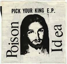
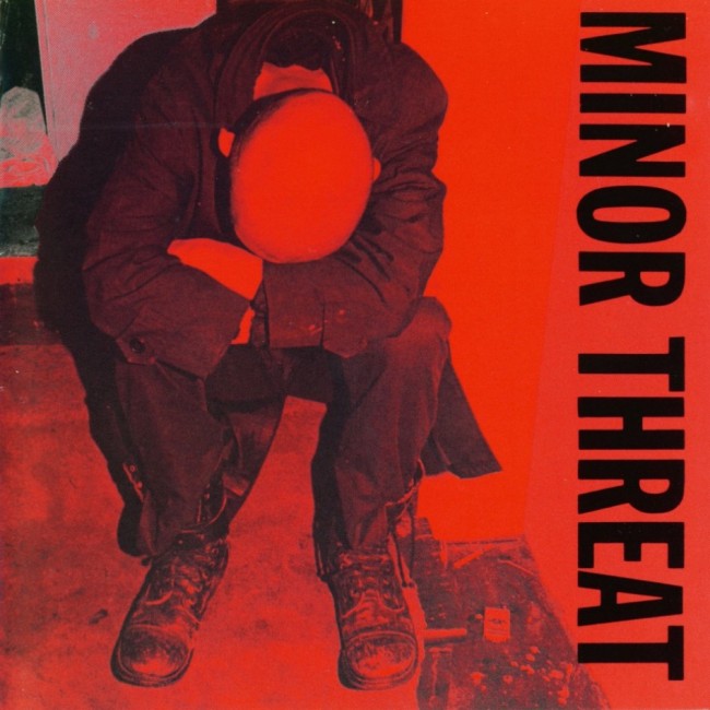
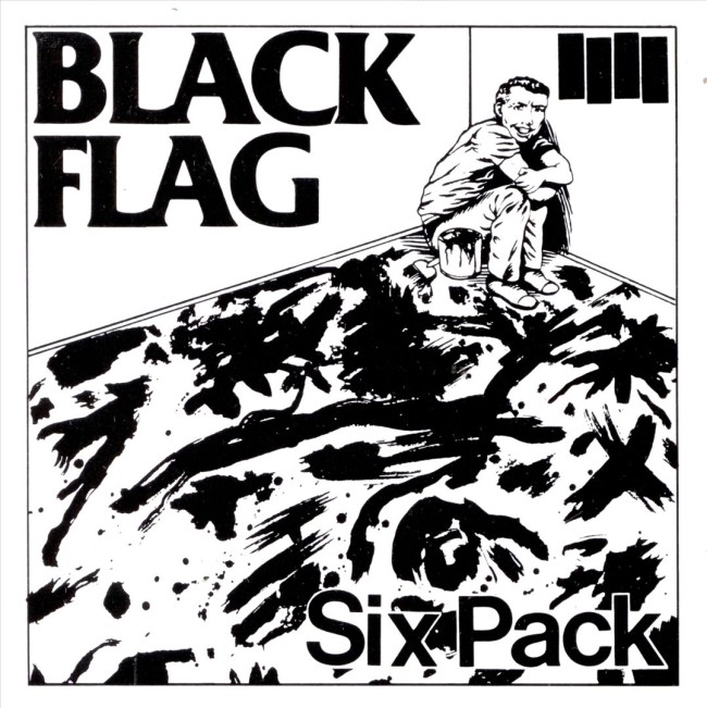
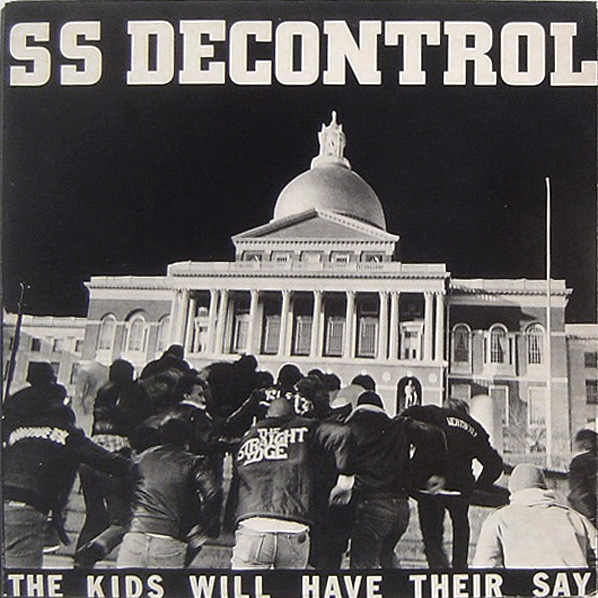
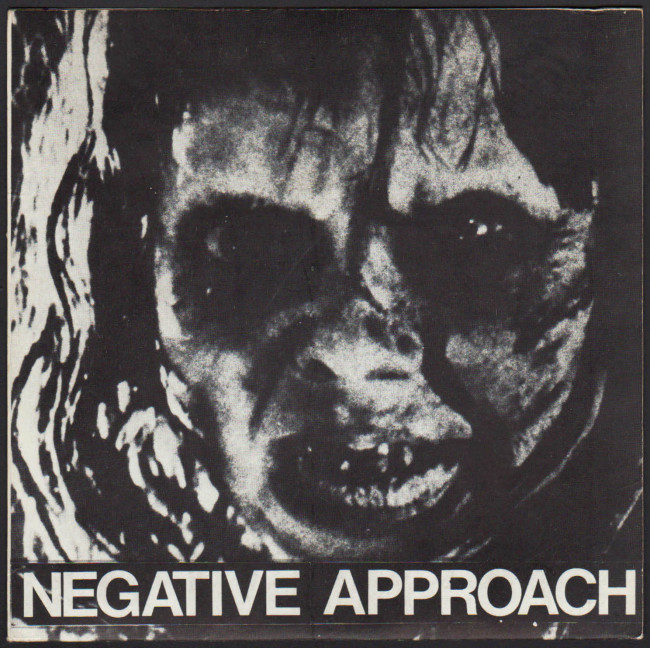
Think of a few albums from relatively the same time [1981-1983]: Poison Idea Pick Your King, Minor Threat Filler, Black Flag Six Pack“, SS Decontrol The Kids Will Have Their Say, and the Negative Approach 7″.
They couldn’t be more different and all told a unique story-they have intrigue. You can take a pic of a kid sleeping at a show or have Raymond Pettibon do your artwork, but it’s not going to tell me anything about your band.
Not everything needs to be arty or strive to be original, but what made so many ’80s records so iconic, was that they were part of the story. So if you’re just expanding on someone else’s idea, without adding anything new, you’re not going to capture that same spirit. It might look rad, but it’s hitting the same notes. It’s the same with art. I could tell you when I was a freshman in art school, who everyone’s influences were, because few students had really dug into the canon of art. You like Warhol or Basquiat or De Kooning, and maybe do a sucky version of that. Then you really immerse yourself in ideas and artists who were lesser known, while your skills get better, and suddenly you’re doing YOUR art. If you just keep trying to make a portrait of Marilyn Monroe, you’ll probably be able to make a pretty sweet one after four years, but that’s not an idea, it’s just reproduction in a sense.
Harshforms – Taking up the four ways how hardcore graphism changed post-computer above, I totally agree with the first and second point, its slickness and well-functioning production line it can rely on. As for the third point – the explosion of styles in hardcore graphism – don’t you think that this development is also linked to the way hardcore grew and split in so many sub genres and scenes over the past two decades – a lot of them hardly communicating and building up their own aesthetically repertoire?
As for the forth point – the imitation of 1980s hardcore visuals – I’d like you to elaborate a little bit more on this one: Do you have a rather recent example of a design in mind that is a “product of the time”, an identity build “with what’s around”? I also wonder if you can really so easily dismiss most of the newer layout as “imitation.” Isn’t building upon a preexisting formula also keeping a tradition (and thus hardcore) alive and also in the process making your layout legible and easily classifiable as hardcore?
Anthony – Hardcore is just a style of punk, not an aesthetic. I want to clarify something. I’m not dismissing newer design, I just think it’s easy–as it was in the 80s and 90s–to replicate something rather than do something new. I want a layout to tell me about the band: are they funny, serious, smart or cool?
I guess I touched on this previously, but if you’re using that sleeve, T-Shirt, or flyer to tell someone else’s story or even just use the impact of their visuals, it seems like a wasted opportunity to me.
[1] Layout by Jacob Bannon shop.nuclearblast.com, [2] Illustration by Lina Garsys discogs.com
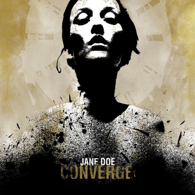
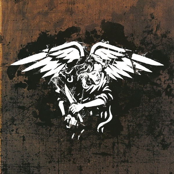
What was cool about the post-computer design abuse boom, were new aesthetics and ideas being more. Whether it’s Jacob Bannon and Aaron Turner, Linas Garsys’ illustrations or later Michiel Walrave’s work, they did something different that could be personalized to the bands, instead of just “Hey, can you draw something that looks like a Breakdown sticker?”
I also liked how the Lockin Out releases had some fucking personality and spunk–they really seemed to be true to who the bands were and where they were coming from, even if they were steeped in their influences. I think that’s an example of homage without just re-doing what has already been done. Maybe they used some of the devices of the past, but it was their take on it.
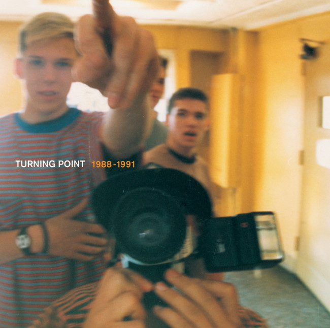
I also thought a lot of what Jeremy Dean for Jade Tree along with Jason Gnewikow was refreshing at the time, and mainly done with a computer. They brought in a different set of tools and aesthetics, which of course got appropriated, but really gave a visual identity to the bands and label. It was bold to choose that image for the Turning Point discography and I’m so glad it was that instead of another “ripping live photo,” because the band was more than that and it really captured what was different about them, without being too tricky or flashy.
Harshforms – Speaking about formula, skimming through your answers, you actually mention as the two central building blocks of hardcore layout: [1] a sans-serif font and [2] an image [(live) photo/image/hand drawn art]. Do you agree with this?
Or asked differently: What has to be on a cover for it to be hardcore?
[1] walkamongmusic.blogspot.com, [2] deadformat.net, [3-6] fuckedup.cc
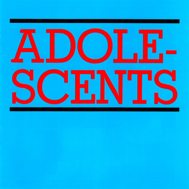
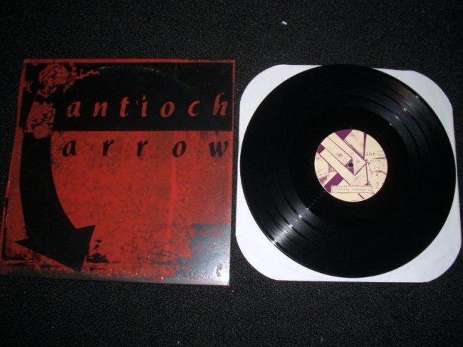
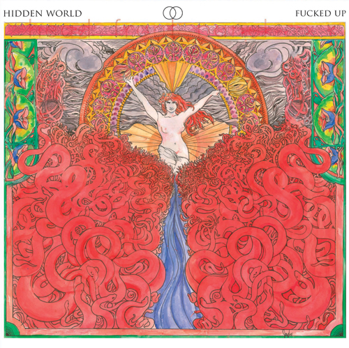
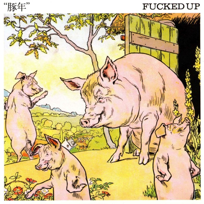
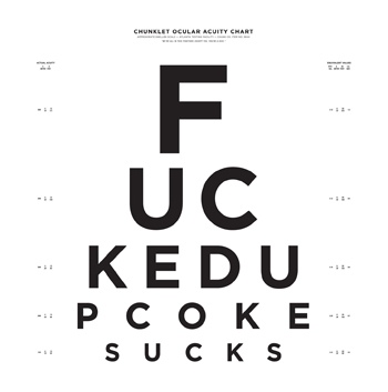
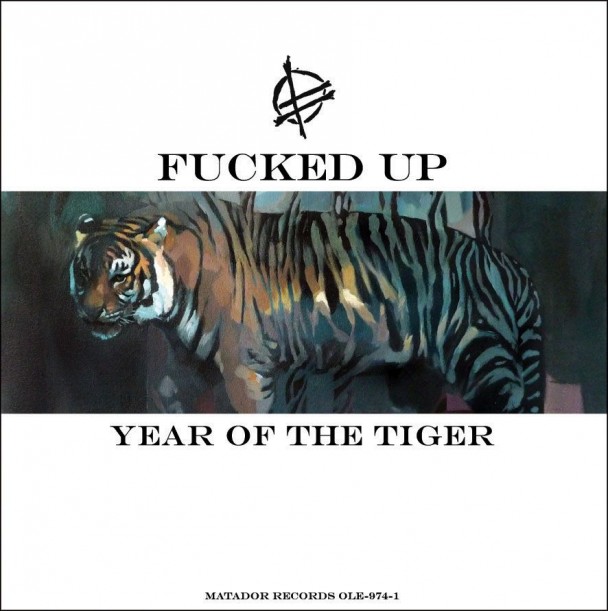
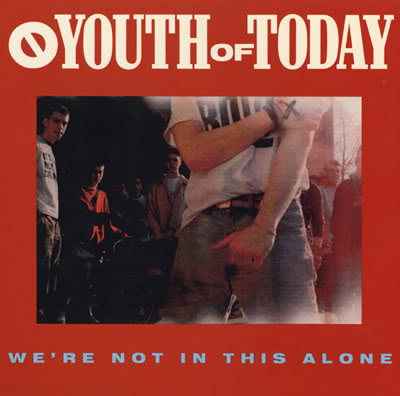
Anthony – Anything you want. That’s it. The Adolescents’ Blue Album is hardcore. The Trip 6 7″ is hardcore. Antioch Arrow In Love With Jetts is hardcore. If there’s a reason why you want to put a picture of bowl of fruit, that’s hardcore too. Fuck it. Think of some of the shit Fucked Up pulls off. You can’t say they aren’t a hardcore band. And some of my favorite covers are just a live shot, I celebrate it all really. Remember those ’90s Youth of Today reissues on Revelation? That was abuse of Photoshop. There was no need to “update” those layouts: they’re perfect. I don’t want some spray paint stencil font on We’re Not In This Alone, I want some dudes chilling there, with their heads cut off, so I can imagine that I’m one of them.
[1] punksinvegas.com, [2] wikimedia.org
art4punks.blogspot.com
Harshforms – Also, could you elaborate on hardcore imagery? In Radio Silence, you ordered the records in the last part based on differences in imagery. I counted 12 different classifications and I wonder if you could talk a bit about this?
Anthony – Ha yeah! That was one of the last things we did and we were going fucking crazy about how we’d do it. At first we were going to just do it alphabetically, but we thought grouping them by “style” would be more compelling and interesting. Without grabbing a copy of the book, I know we had live photos, posed photos, B&W contrast images, type only, flames, suffering, appropriated images, realistic illustration, cartoons, graffiti, etc. When we were showing Ian MacKaye a draft of the book, he pointed at one of the suffering images, I think it was an Infest cover and said how he didn’t like images like that on punk records. He thought it was too easy, like “Oh look, someone in pain or something violent.” It was as if the image does the heavy lifting for the music. I really liked that comment and thought it made perfect sense.
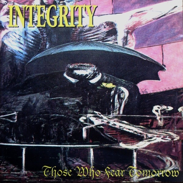
There are like 20 different covers for Integrity’s Those Who Fear Tomorrow and they all kind of suck. Now visualize it just solid black with the name and title in spot varnish and their logo and suddenly, there’s some mystery. Take it out of the sleeve and get MICHA screamed at you and it’s more impactful instead of something that just looks “evil.”
Evil is so overrated.
Back to Radio Silence. Putting in that selected discography was really important to us and I wish we could have had the images larger, but as a concept it worked for us. Also, when we assembled it there was no Discogs or detailed Wiki entries about hardcore albums, so we had to rely on the records themselves if we still had them in our possession and the Flex! books. So here’s an important take away: Put all the historical info on your records folks. Some idiot might want to document it in the future and if you omit the year it was released and recorded etc., it’s going to be a drag. Oh, and put the fucking year on your flyers please too. That drives me nuts.



Leave a Reply