[1] Drawing for artist The Pizz taken from Garage Magazine No. 18; [2]; [3] ; [4]; [5]
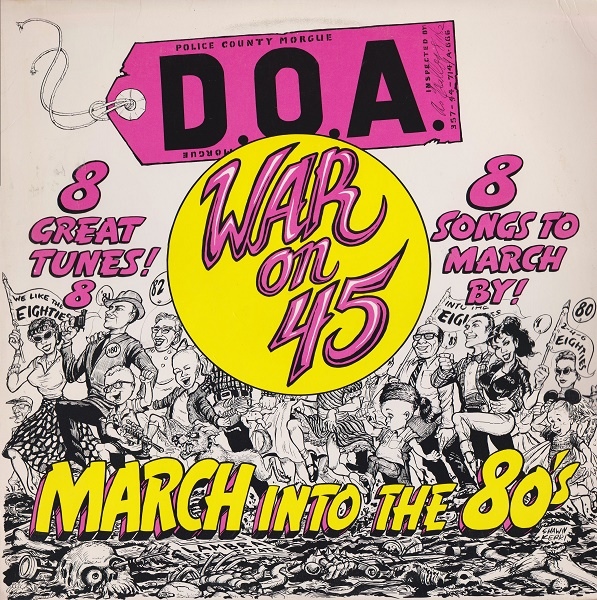
Cartooning humans was certainly a mayor aspect of Shawn Kerri’s work, in which she also chronicled early 1980s hardcore in Los Angeles. Apart from drawing hardcore kids in action –mainly dancing at shows–, some of the other work she did for hardcore bands also represents people – like the rather true-to-life portrait of The Adolescents, a scared woman on a Fear flyer or the marching people she drew for D.O.A (above). But this time around I’ll talk about death, animals and humor — three other recurrent themes in her illustrations.
pinterest.com
Like a lot of her contemporaries, Kerri was very fond of death imagery. Skulls, skeletons and corpses are recurrent motifs in her work. Death was a constant presence throughout her work from the very first flyer onwards. According to Emslinger, the author of Visual Vitriol, Kerri can be considered as one of the precursors — next to Pushead or Mad Marc Rude — that introduced skulls and skeletons into hardcore(-punk) flyers.
Emslinger actually traces back the roots of skulls on hardcore(-punk) flyers to 1978. This was the year when the (Powel-Peralta) Ray “Bones” Rodriguez deck came out with “a skull with a sword in front of it”. This drawing was first sketched out by skater Ray Rodriguez who – at 12 years old – found inspiration in a sword and skeletal hands from the war memorabilia collection at his parents’ house and the skull of Grateful Dead’s Steal Your Face album cover. This sketch served Vernon Courtland Johnson, at that time graphic artist at Powell-Peralta, to create the final drawing.
[1] skateandannoy.com; [2] dead.net
Some of Kerri’s flyers with skull illustrations “became classics in their days,” as she stated herself. This holds especially true for the second flyer she illustrated for The Germs, also known as the “Germs Return” flyer (underneath). It is also one of the only two flyers she ever commented on; probably because it had, according to her, “quite an impact on people.” “[D]o a flier,” was what The Germs lead singer Darby Crash had told her and she came up with a “mohawked skull breaking through a blue circle [The Germs’ logo].” Derby Crash was “strangely excited” by the outcome that actually represented him as a dead person: “the skull and the hairdo are undoubtedly him,” Kerri states. Derby Crash’s excitement for the flyer disturbed Kerri and that even more in the course of history because Derby Crash actually died by an overdose after the show that was announced by the flyer. It was “very spooky” and “like a pre-post-mortem,” Kerri resumes Crash’s liking of the flyer and wonders if he had already suicide on his mind when seeing the flyer the first time.
This didn’t prevent Kerri from drawing skulls. Being confronted with her friends’ deaths caused by drug abuse or simply with death being a possible outcome of her own consumption of hard drugs might have even encouraged her to do so.
[1] ; [2]; [3]; [4] “The Skull Hall of Fame” from Flipside Magazine No. 33 (1982) taken from Garage Magazine No. 18; [5]; [6]; [7]; [8]; [9] “How to Draw Skulls” from Flipside Magazine No. 33 (1982) taken from Garage Magazine No. 18 , [10] flickr.com; [11] taken from Garage Magazine No. 18
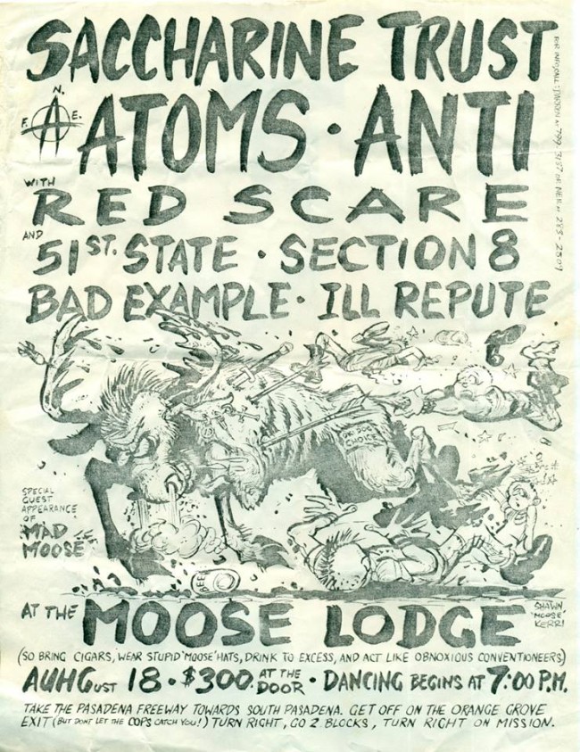
Apart from skulls, a nice collection of animals, fictive and real, populated Kerri’s flyers. A moose, a doberman, a horse, a dragon and eagles were sometimes drawn with reference to the place where the concert took place (Moose Lodge) or the bands on the bill (Doberman, Tex and the Horseheads). At other times, and especially for the flyers Kerri drew for the band The Atoms, animals rather served as symbols. The first flyer Kerri drew for them in 1981 thus features a dragon. It is actually a sophisticated, adapted version of the 1978 drawing Wes Humpston did for a Jim Muir Dog Town skateboard. In two follow-up flyers for The Atoms, the Reichsadler of the Third Reich became the main motif and that in astonishingly accurate detail compared to Kerri’s usually cartoonish drawings: the eagle’s head is turned left and it sits on a oak leaf Victor’s Crown. Only the swastika (normally situated in the oak leaf crown) was substituted, once with a circle-A and once with a skull. This is actually the third time that Kerri uses or makes a clear reference to swastikas. Apart from describing the Skank Kid as taking on the form of a swastika, the punk she drew for the artist The Pizz also wears it on his leather jacket (above). I guess this can be considered as a heritage of punk (with which I feel very uncomfortable with) but I’d be really curious from where Kerri copied the eagle.
[1] ebay.com; [2] tofo.me/tag/SK8Cheddar600to699; [3] ink361.com; [4] ebay.com
Last but not least, it is impossible to talk about Kerri’s work without mentioning the humor that transverses it; something her flyers were also known for. After all, Kerri was a cartoonist. Humor, in general, was according to Emslinger, a(nother) heritage of punk that Kerri still cherished but got lost in hardcore later on.
Kerri thus rebaptizes Redondo Beach into Redundant Beach, adds the adjective “bad” to Ukrainian Culture Center and Melrose on the flyer that promotes Bad Religion and the Bad Brains on the same bill or she twists some usual information figuring on handbills:
“So bring cigars, wear stupid ‘moose’ hats, drink to excess, and act like obnoxious conventioneers,”
“No age limit, kiddies”,
“No chains, no bottles, no guns, no cans, no ground-to-air missiles, no nothin!”


Leave a Reply