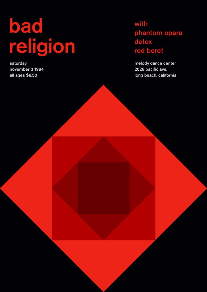
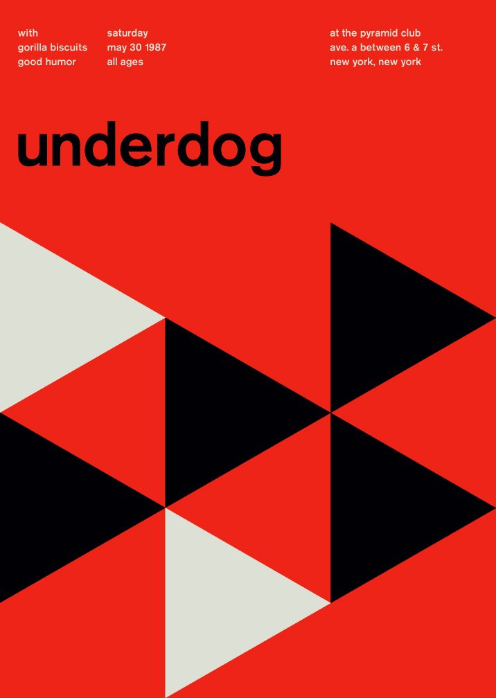
In his ongoing project swissted, Mike Joyce takes old hardcore/punk flyers and sets them in International Typographic aka Swiss style – a style developed in 1950s Switzerland, which builds on cleanliness, readability, asymmetry and sans-serif typefaces like the mother of grotesque typefaces “Akzidenz Grotesk”. Mike Joyce has given another face to more than 200 flyers by now and doesn’t seem to stop.
Interesting about these flyers is that they are a good example for why hardcore/punk has its own typography. These flyers are really nice to look at and well executed. However, most of them don’t really work for me expression-wise as they don’t exactly convey hardcore or punk’s aggressiveness, roughness, hate or DIY spirit.
Images from swissted.com


Leave a Reply