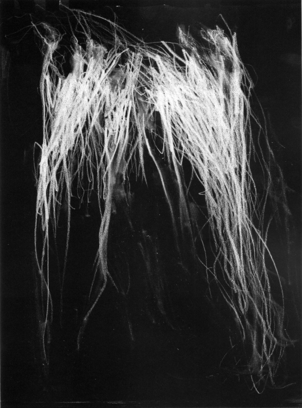
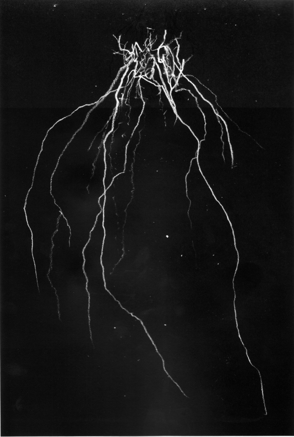
Images: historyofourworld.wordpress.com
This artwork done by Andrew Mcleod above is what comes out if you throw extreme metal logos in the mix with Cy Twombly. For quite a time I wanted to collect all the different writings on “extreme metal” logos spread around the web in one post and seeing these paintings was just the perfect hook.
For this post it is quiet usefull that all these different music styles as death and black metal are often lumped together under the category “extreme metal” as I will exactly do this: lump these logos together. It’s justified in a way because they all have certain similarities which are an exorbitant symmetry, the preference to black and white and them being mostly handdrawn. Robert Holmkvist at Design Assembly spells out another similarity, which is their illegibility: “Sometimes I wonder”, he writes “if the legibility of a bands logo reflects its sound; the more unintelligible sound the more illegible the logo. For example the logos of Black Metal are harder to decipher than most Death Metal logos, which most certainly reflects that the former genre is more underground than the latter”.
Gary Warnett points out the slight differences between Black Metal (BM) and Deathmetal (DM) logos, though. He states: “while the BM Logos are most times filled up with turnaround crosses and pentagrams or other occult-icons DM logos goes another direction more brutal less occult.”
Sample pages from Book “Lord of the Logos”published. Courtesy of Gestalten
One person you will always stumble over when interested in these type of logos is Christophe Szpajdel. This Belge living in Great Britan, drew over 7000 logos until now. His interest for logos was sparked at the age of seven he tells logodesignlove when he saw the logo of the band KISS and since then this love holds true. Having a day job in forestry engeneering, he names architecture, natural surroundings like landscapes, forests and mountains as his main sources of inspiration which is obvious in the juxtapositioning of his logos with his nature photos in his book “Lord of the Logos”. To create a logo takes him between two to six weeks or more.
Sample pages from book ” Logos From Hell” from riddickart.com
Freelance illustrator Mark Riddick is another person which is often cited in relation with logos for extreme metal bands. He is also the editor of the book “Logos From Hell” which compiles logos from “extreme metal” bands as can be seen in the sample pages above. He began his career in 1991 when illustrating demo tape covers, 7″ and LP covers for underground death and black metal band. “My greatest influence is derived from the old cut-and-paste underground death/black metal fanzines”, he tells Rodney Githens at metalsucks, “I collected from the early 90s. The black and white, do-it-yourself, photocopied ‘zines packed with gruesome filler artwork still resonates in my style and approach to this day”.

Images: Typeface Wilhelm Klingspor Gotisch and sample of sketchbook for font “Pure fuckin’ Cryptomania” from Schäfer
For those people who don’t get hold of these two guys to get their logo drawn, don’t have the money to pay someone else or feel they don’t have the creative ability to follow the 9 step guide by James Stone to create an “extreme metal” logo themselves, there are a couple of typefaces which are regularly named in exchanges like this on typophile when talking about extreme metal logos which are: Wilhelm Klingspor Gotisch / Cloister Black / German Unterground and Duc de Berry. The font “Pure fuckin’ Cryptomania” created by Stefan Schäfer seems a pretty interesting alternative aswell. The developing process of this font is documented on his page through flics of his scetchbook as the one above.
More
/ Site with a collection of “extreme metal” logos.
/ Great podcast by Alan Rapp at Critical Terrain about heavy metal (yes, “heavy” not “extreme” – the good old classic) design (about 8 min).
/ VBS documentary on black metal from Bergen, Norway.


Leave a Reply