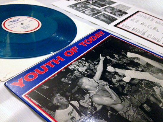
[1] Youth of Today’s “Break Down the Walls” from doublecrossxx.com
How can a live photo of Elvis look more hardcore than one of Judge? A while ago, I decided to take a closer look at the people behind the covers and layouts of some of the most well-known hardcore bands and make it a follow-up series here. Dave Bett is sure enough a perfect example to start this off. He worked on a lot of nowadays “classic” layouts of Revelation Records since the late 1980s – at a time when Revelation “really got moving.” The NYC Hardcore, Youth Of Today’s Break Down The Walls, Bold’s Speak Out, Gorilla Biscuits’ Start Today and Judge’s Bringin’ It Down all carry his signature.
The collaboration between Bett and Revelation Records started when Bett was hired in 1987 as a houseart director to design albums for Important, an indie label distributor, and Revelation Records’ founder and owner, Jordan Cooper, contacted him. Cooper as a middleman would contact Bett for a layout with already specific directions in mind and a statch of photos to hand him. So often Bett would not create something from scratch but had directions and material to use.
Images: (2) Gorilla Biscuit figure: nevergoinside.wordpress.com
The Gorilla Biscuits LP was created this way. The cavemen were apparently drawn by CIV and also Walter Schreifels, Gorilla Biscuits’ singer, had a say in the layout. That this joint activity in Gorilla Biscuits’ branding was more than succesfull is reflected in the release of their figure in 2008 (with a follow-up in 2009) which was sold out in two hours.
Even if Bett was not in charge of all the layout coming out of Revelation – bands often did their own layout for the inlets -, he definitely influenced their design drastically. It can be boiled down to some simple ingredients: a live photo and the name of the band and record usually in bold and sans serif capital letters. Latter were set in a justified or centered alignment and sometimes bars were added as graphical elements. The New York City Hardcore is thus always mentioned as the example of layout coming out of Revelation.
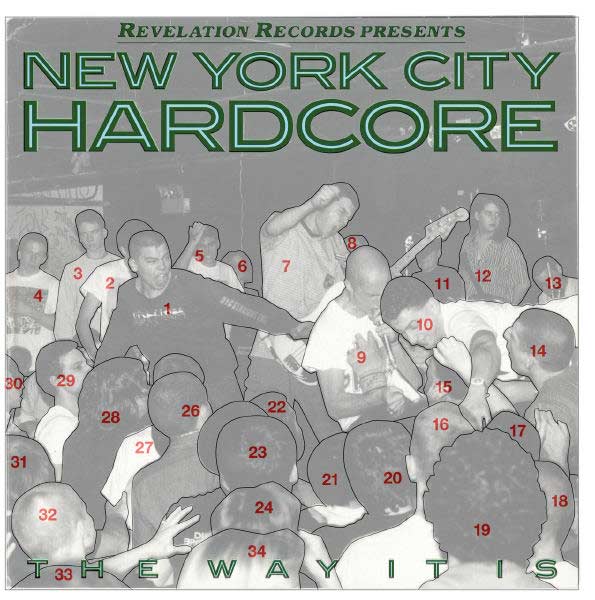
The legacy of live photos and bold lettering in hardcore layout is sure enough for a huge part due to David Bett’s work. The Judge LP is therefore another record which is often held as the trademark Revelation look. Bett’s traces the inspiration back to Elvis Presley. He says: “(…) the Judge record felt like our version of the cover of the Clash’s ‘London Calling’, which was an even more exact copy of an Elvis cover. Just taking a great guitar image with all the energy that goes into a live performance, running big type in good colors down the side. We identified with fat serif bold typefaces because they had a strength and solidity that made sense with the music.”

Image: Princetown Regular used on the Judge cover and made digitally available by Dobek Ohashi from crucialxtimes.com under the name “Varsity and College Font Pack.” (Right now -03/2014- his page is down).
Jordan Cooper wanted especially the typography to reflect the straightforwardness of hardcore. Dave Bett and him “spent a lot of time talking about typefaces and lettering”, as he states in an interview. He wanted to get hold of typefaces which were neither available on computer nor as rub on letters and which were not overused yet.
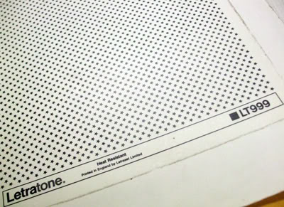
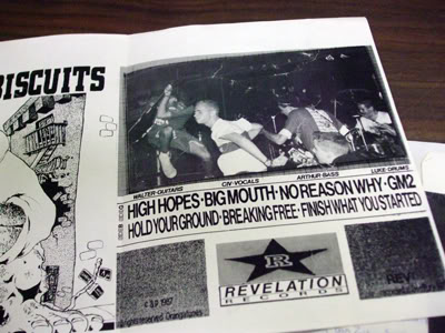
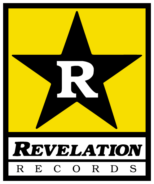
Images: (1) Letraset stars used by Revelation Records from doublecrosswebzine.blogspot.com, (2) Close-up “Together” Compilation 7″ – Rev002 from seekingthesimple.wordpress.com, (3) First Revelation Records “logo” on Sick of it all “s/t” 7″ – Rev003 (above left) from seekingthesimple.wordpress.com, (4) Original Gorilla Biscuits 7″ mock ups with alternate Revelation Records logo on back cover, Photo: Tim DCXX from doublecrosswebzine.blogspot.com, (5) Revelation Records logo from revelationrecords.com, (6) Dangerhouse Logo from davescattered.blogspot.com
David Bett also gave the last twist to Revelation Records’ logo (an earlier version on the right above). “I set the type and cleaned it up.” he remembers in the same interview with Gordo from Doublecross. And this is how it is used ever since the New York City Hardcore compilation. This branding process of Revelation Records was jointly done by quite a few people as you can read over here or here. Ray Cappo from Youth of Today pushed for a visual identification of Revelation Records. He had the idea to use a star in the background and advocated the black-yellow color combination as used by Dangerhouse Records. The first three records sported thus Letraset stars. A later member of Gorilla Biscuits, Alex Brown, reworked these elements and had the idea to put the letter “r” in the star and the labels’ name inside a box underneath. This is how the logo was used for a bit until Dave Bett eventually tidied it up.
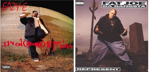
Dave Bett didn’t stick to hardcore layout, though, but to music layout. He moved on from hardcore to do a lot of layout for rap artists like Easy E, Common, Fat Joe, Wu Tang Clan in the 1990s. Still, in these works, we find the same ingredients of a photo as center piece and minimal use of lettering. Afterwards he worked for Sony BMG and did covers for Springsteen, Aerosmith, John Legend and got a Grammy nomination for a Tori Amos limited edition package of her album Scarlet’s Walk he did together with Sheri Lee. Nowadays he is the design directer for Columbia Records.
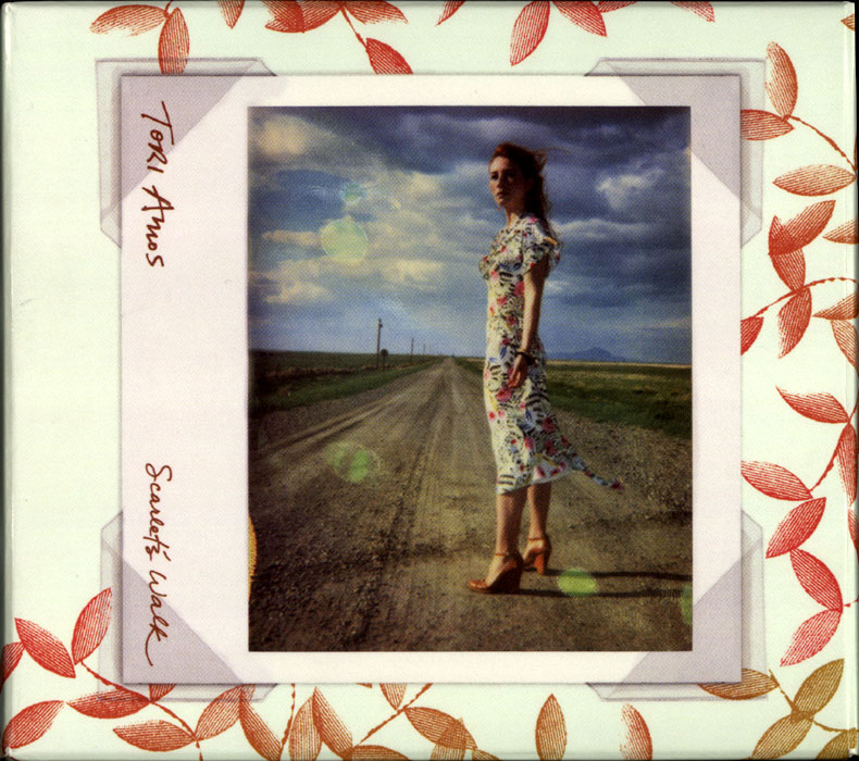
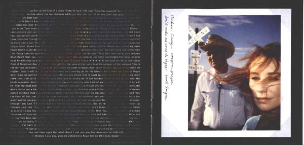
Images from thedent.com: Cover and inlet of Tori Amos’s “Scarlet’s Walk” special edition CD which came along with a DVD, a map with lyrics, postcards, stickers and some other gadgets




Leave a Reply